
In 2015, Berkeley-based design journalist Roman Mars delivered a TED Talk (now at 6.3 million views) about city flags. The video went viral and introduced a national audience to ideas about good flag design that he’d been discussing for several years on his podcast and radio show 99% Invisible.
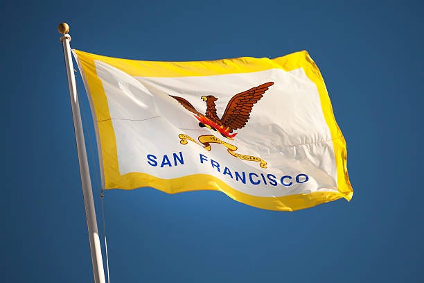
Mars’ message: A great city should have a great flag — but the flags of most cities aren’t so great. Exhibit A was his example of how not to design a city flag: the flag of San Francisco.
Sign up for The Bold Italic newsletter to get the best of the Bay Area in your inbox every week.
Yes, the current San Francisco flag flies at major government and commercial spaces. But, Mars points out, the people of San Francisco have not truly embraced it—the flag is not ubiquitous on storefronts, in apartment windows, on T-shirts, bags, pins, patches, and tattoos. A great flag would be.
A big reason this is so, Mars says, is that the San Francisco flag is poorly designed.
Mars pegs his critique to five principles of good flag design codified in a booklet called Good Flag, Bad Flag, put together by vexillologist Ted Kaye for the North American Vexillological Association (NAVA). Broadly speaking, vexillology is the study of flag history, design, and use.
The principles are these:
- Keep it simple. The flag should be so simple that a child can draw it from memory.
- Use meaningful symbolism. The flag’s images, colors, or patterns should relate to what it symbolizes.
- Use two or three basic colors. Limit the number of colors on the flag to three, and make sure they contrast well and come from the standard color set: red, blue, green, black, yellow, and white.
- No lettering or seals. Never use writing of any kind or an organization’s seal.
- Be distinctive and be related. Avoid duplicating other flags, but use similarities to show connections.
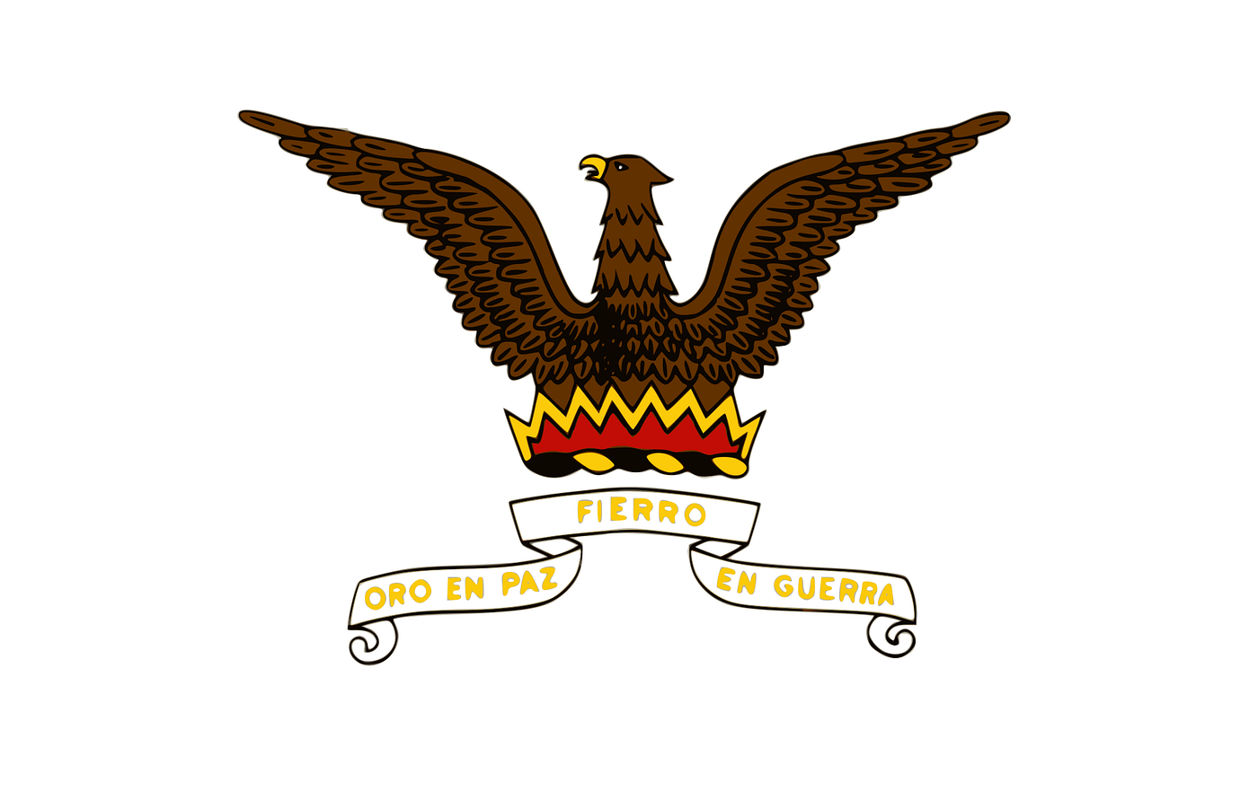
The following interpretation of the current flag of San Francisco was created in 2005 by a company called Vector-Images.com. This specific version of the flag doesn’t appear to have the backing of San Francisco city government. But, probably because it was for many years the illustration for the Wikipedia entry on the San Francisco flag, this is the version that Roman Mars used in his talk and that has appeared in many online articles about the flag. And, because the vector artwork is both scalable and royalty-free, this frequently is the default version that is marketed by companies that manufacture and sell San Francisco flags, stock images/video, and other items, like magnets and stickers, that feature an image of the flag.

As you can see, the central figure is a phoenix rising from flames, which has been included in every iteration of the flag since 1900 (and possibly before). The motif was first introduced as a San Francisco symbol in the 1850s, when it was included in the city seal to symbolize the city’s recovery from multiple fires and earthquakes during this period.
But the flag design as a whole tramples on principles one, three, and four. Too complicated and busy. Too many colors. Way too many letters — especially the literalistic inclusion of “SAN FRANCISCO” in enormous block letters (and in a crappy font). And — not for nothing — the poorly rendered iconography looks like clip art. (That’s because it is.)
In an effort to address — and redress — this civic travesty, Mars partnered with Autodesk in May 2015 after his TED Talk in March, initially with the hope of sponsoring a design competition and engaging city officials in a project to “redesign” the San Francisco flag.
Asked on Twitter, in March 2017, if the effort had “run out of steam,” the project responded: “It has a bit, unfortunately, yes. Without the political will, nor public pressure, the initiative sadly fizzled.”
Mars suggests that an update of the San Francisco flag could preserve certain beloved ideas and elements, like the phoenix.
But my guess is that many who have encountered Romans Mars’ San Francisco flag project, with its language of “redesign,” assume his agenda is to scrap everything about the current flag and its 118-year-old tradition and start over with a blank sheet of paper.
This is the sort of thing that would make public officials skittish, to say the least.
Here’s the thing: The San Francisco flag that was used from 1900 until the early 1920s — and which is the basis for the current flag — hewed much more closely to the accepted flag design principles that Roman Mars and others celebrate.
It was a better flag.
Recently, the flag — and the need for a more modern design — has been back in the news with San Francisco urbanist and planner Brian Stokle debuting a new look currently being flown in spots throughout the city to show solidarity during the pandemic.
More on that later. First, let’s consider that the solution to San Francisco’s flag problem is right there in the flag’s history.
Let’s hop in our time machine, shall we?
On September 13, 1859, California U.S. Senator David Broderick and former California Supreme Court Justice David Terry met for a gun duel just outside San Francisco, near Lake Merced. Broderick was wounded, and he died three days later, on September 16th.
The next day, San Francisco was in mourning. San Francisco City Hall was on Kearny Street, across from Portsmouth Plaza. The city’s Daily Alta newspaper noted that official recognition of Broderick’s death had begun on the 16th, when “[t]he city flag, on the dome of the City Hall, and the national banner, from the liberty pole on the Plaza, were drooped in token of mourning.”
This is a very early reference to a San Francisco flag separate from the national flag.
By 1862, the City Hall building on Kearny Street was topped with three flag poles aligned left, center and right across the front of the building.
On July 4, 1862, the Alta carried the following item:
CITY FLAGS.—At half-past 4 o’clock this morning, will be thrown to the breeze from the tall centre staff of the City Hall, a handsome flag bearing the new coat of arms of the city; on the right the national ensign, and on the left of the main staff the old city flag will be displayed. The mammoth city flag will be unfurled in the centre of the Plaza at sunrise.
By “coat of arms” was meant the official city seal.
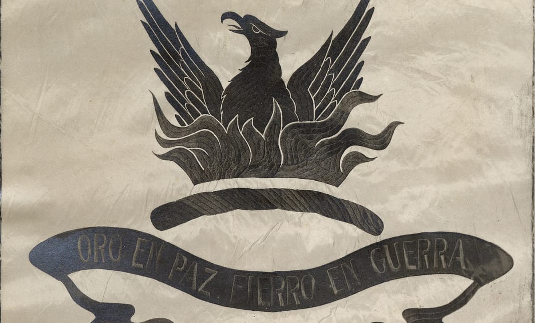
The original seal of the City of San Francisco was adopted in 1852. Here’s how the seal appeared three years later in the classic eyewitness account, The Annals of San Francisco, published in 1855.
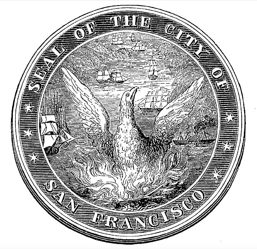
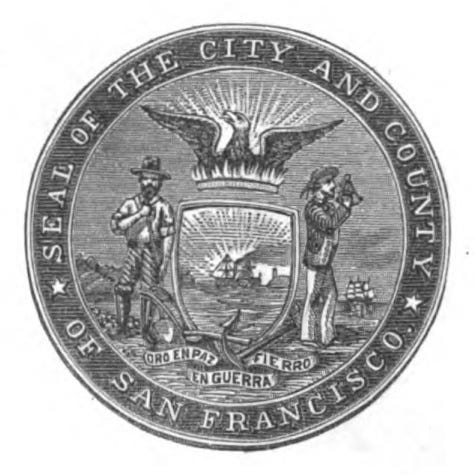
The new—and current—seal of the City and County of San Francisco was adopted in 1859. Here’s how the 1859 seal appeared in the 1859–60 Municipal Reports published by the San Francisco Board of Supervisors.
Based on the 1862 Alta item, it stands to reason that the city flag that flew in mourning for David Broderick might have featured the original city seal of 1852 and that the flag that debuted on July 4, 1862, featured the new seal of 1859.
Visual resources—photographs, illustrations—that could provide some idea of what these early San Francisco city flags looked like are scarce. But, there are glimmers.
For example, The Society of California Pioneers has in its collection the following flag with an interpretation of the 1852 seal; the Society dates this flag as 1852. Flag authority Jim Ferrigan thinks the red border may suggest a connection to the fire department (which was volunteer during this period). But, even if so, a similar flag without a red border could have been the official San Francisco flag sometime between 1852 and 1862, when the flag was updated to include the new city seal.
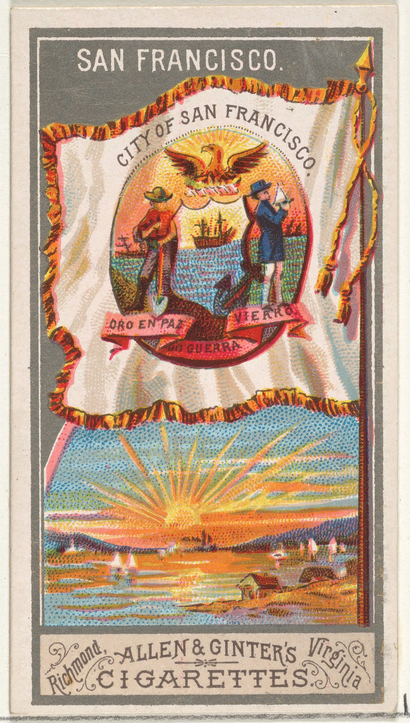
A second example comes from 1887, when the Allen & Ginter tobacco company of Richmond, Va., issued a “City Flags” collecting and trade card series, with cards being included in boxes of Allen & Ginter cigarettes.
The series included the following card for San Francisco.
Apparently, the city flag fell into disuse. For, by early 1900, San Francisco did not have an official flag. The city’s mayor, James D. Phelan, sought to correct this and personally sponsored a citizen design competition, with an award of $50 from his own pocket. Phelan had just won the money himself, as a prize from the Curtis Publishing Company, of Philadelphia, for his article, “How to Make Corporations Pay Their Taxes.”
The competition was not without its glitches. In fact, it started out as a bit of a bust. Local newspapers derided the entire enterprise as a silly, superfluous and self-indulgent vanity project, with the San Francisco Chronicle quipping in its March 17th edition that “[c]ompetitors may choose a guinea pig, a rat or a monkey as the central figure.”
Some 100 concept drawings were submitted. But, on March 30, 1900, leading San Francisco newspapers—including the Chronicle, the Examiner and the Call — reported that the selection committee had found all of the proposals wanting, so were reopening the competition.
A few days earlier, the Call had published a withering editorial proposing the Stars and Stripes as a late entry; its headline announcing Competition 2.0 was especially blunt: “Flag Experts Insist Upon New Designs: Mayor Phelan’s Dream Develops Into a Disagreeable Nightmare.”
For the second round, the committee added some new requirements. The San Francisco Chronicle stated these as such:
Simplicity and striking originality are the most important requirements. The design must not be in more than two colors on a white ground, and must be emblematic of the city. The motto, “Oro en paz, Fierro en guerra,” must be incorporated.
In announcing the “new” competition, the committee singled out a dozen or so competitors for special commendation and urged them to try again. Among this “shortlisted” group was John Marshall Gamble (1863–1957), an artist with a studio at 325 Montgomery Street, who would go on to become a respected American Impressionist painter of California landscapes.
Two weeks later, on April 15, 1900, the Chronicle published the winning concept. Mayor Phelan’s fifty bucks would go to Gamble.
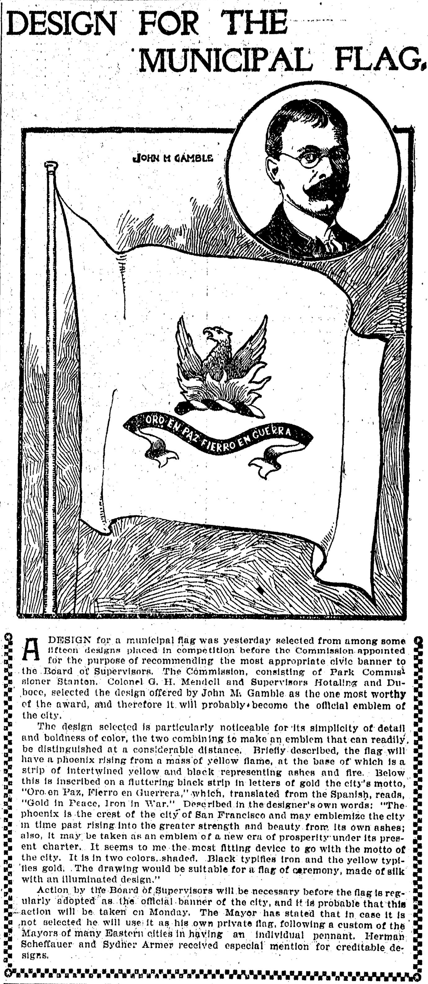
The Chronicle wrote:
The design is particularly noticeable for its simplicity of detail and boldness of color, the two combining to make an emblem that can readily be distinguished at a considerable distance. Briefly described, the flag will have a black phoenix rising from a mass of yellow flame, at the base of which is a strip of intertwined yellow and black representing ashes and fire. Below this is inscribed on a fluttering black strip in letters of gold the city’s motto, “Oro en Paz, Fierro en Guerra,” which, translated from the Spanish, reads, “Gold in Peace, Iron in War.”
The “strip of intertwined yellow and black” is known as a torse. In heraldry, the torse is a braid of two alternating materials — six twists, in the British tradition — that is laid between the top of the helmet and the base of the crest.
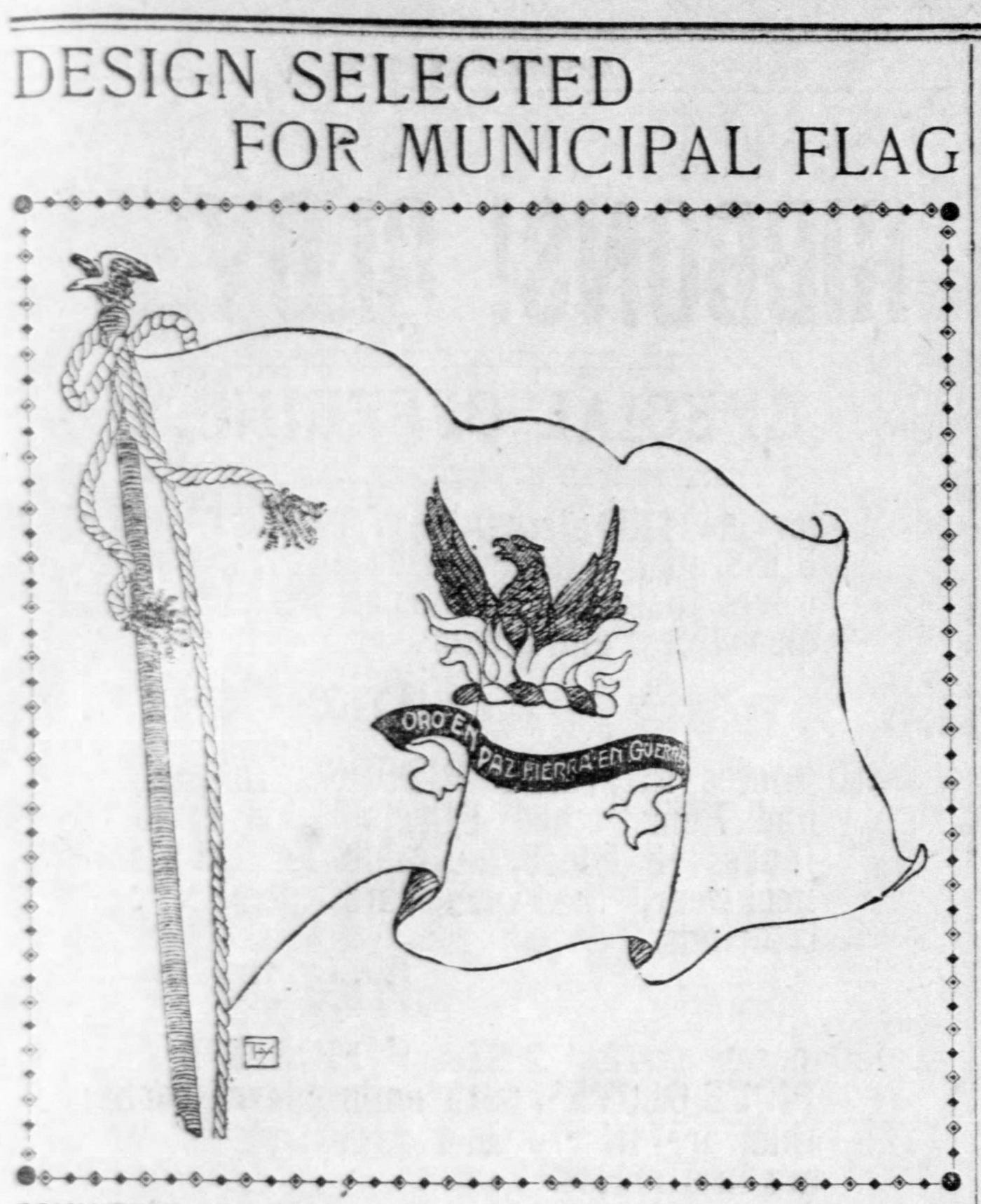
On the same day, the San Francisco Call published the following slightly different variation with its announcement. What appears to be the artist’s initials are at the bottom left of the illustration. As you can see, they are not John Gamble’s.
Yet another variation (below) appeared a few months later in the San Francisco Municipal Reports for the Fiscal Year 1899–1900. The Municipal Reports was a bound volume, published by order of the Board of Supervisors, compiling all the annual reports of the city’s institutions, agencies and offices for a given fiscal year. The 1899–1900 fiscal year ended on June 30, 1900, so the volume would have been published sometime in the fall.
Remarkably, the original flag was produced at least a few months earlier —and, it didn’t really look like this at all.
Arguably, as we’ll see, none of these drawings were Gamble’s. This, together with how, when and where these drawings were circulated in 1900, probably tells us a couple of things:
- The announcement of John Gamble as the “winner” of Mayor Phelan’s competition was a midpoint—not the endpoint—of a larger design process.
- Neither San Francisco’s newspapers nor City Hall itself was especially interested in promoting and publishing a single design standard for the new flag.
But, comparing all the readily available drawings of Gamble’s concept—one more drawing to come—with one another and with the flag that actually got made does bring us closer to knowing both (a) what Gamble himself envisioned and (b) how this vision got translated into the design of the original San Francisco flag.
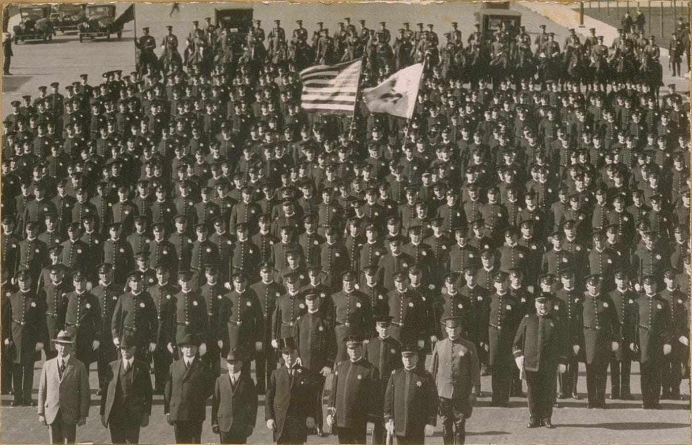
Apparently, only one physical flag was made. Mayor Phelan presented this flag to the San Francisco Police Department at the department’s annual civic inspection, parade, and marching demonstration on May Day 1900. The Chronicle reported that some 500 of San Francisco’s finest were on hand for the affair.
Following Phelan’s presentation of the new city flag, it was Sergeant John T. Fitzhenry who carried the banner during the proceedings. Some decades ago, the following photograph hung at the Eagle Café, on the “street end” of Pier 39 (Fisherman’s Wharf) in San Francisco. It is believed that this is a photo of Sergeant Fitzhenry carrying the flag in the police parade of May Day 1900.
After the flag’s debut, it was kept in a glass case at the Hall of Justice and brought out only for ceremonial occasions.
By the mid 1920s, this singular flag was tattered — or it was destroyed in an “accident” (accounts vary) — and a replacement flag was made in 1929. A photograph of this replacement flag appeared in the October 1929 issue of the Overland Monthly, an influential magazine that operated in San Francisco at the time.
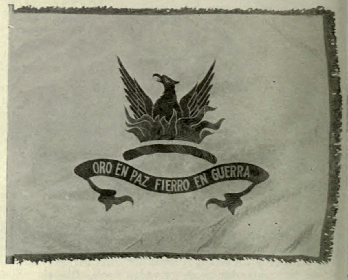
Something one notices right away is that the phoenix and flames of this flag harks back to the original city seal of 1852—not to the heraldic depiction in current seal from 1859.
But, was this 1929 flag an exact replica of the original 1900 flag, or had the design been tweaked a bit from the original?
In its write-up accompanying the photograph, the Overland Monthly attributed the design of the 1900 flag to San Francisco–born sculptor Robert Ingersoll Aitken (1878–1949)—not to John Gamble—and went on to say, in effect, that the 1929 replacement was a copy of the original.
Four years earlier—and four years before the replacement was made—an article that appeared in the San Francisco Chronicle on August 24, 1925 credited Aitken as the designer of the 1900 flag, saying that “the city flag given the Police Department by former Mayor Phelan” was “designed by Robert Aiken [sic] before the fire.”
Aitken was a famous sculptor of the time. He is behind the iconic West Pediment of the U.S. Supreme Court Building (1935), in Washington, D.C.: the nine figures above the inscription “Equal Justice Under Law” on the front entrance of the building.
Aitken has several public artworks in San Francisco as well, including his Goddess of Victory (1903) statue atop the Dewey Monument in Union Square. He also was revered for his design of coins and medals — including a commemorative coin and the official medal for the Pan-Pacific International Exposition of 1915 — so an interest in flag design wouldn’t have been surprising.
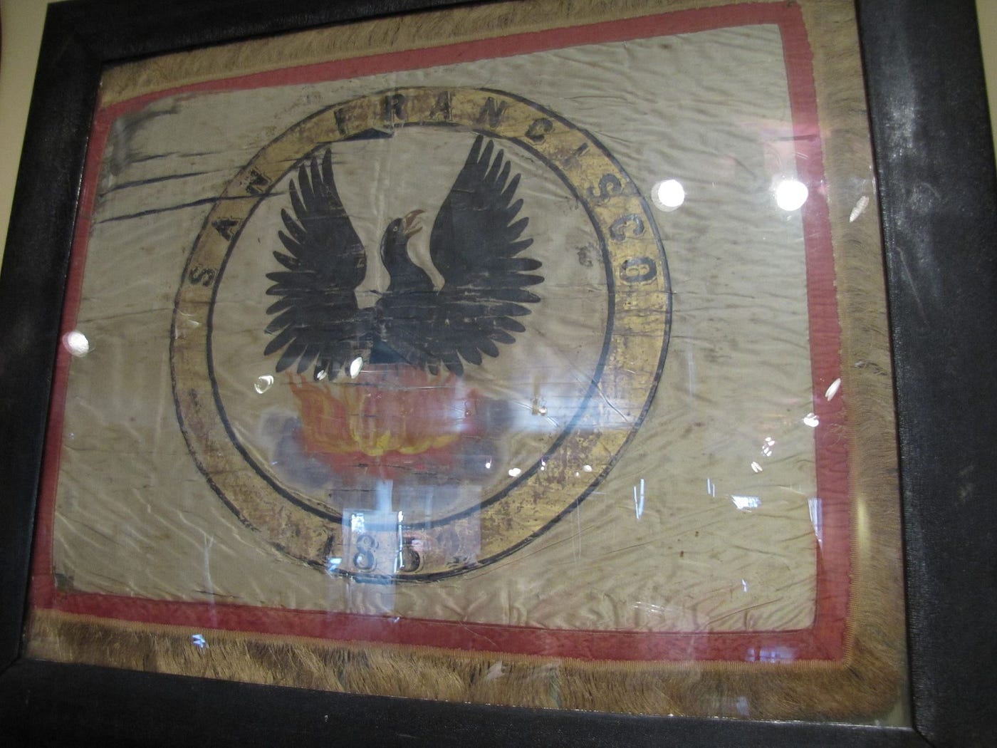
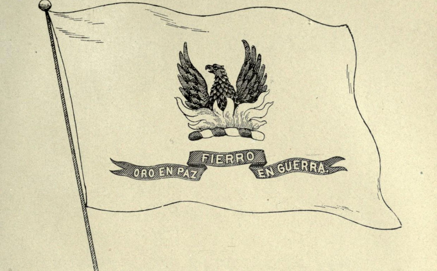
More evidence of Aitken’s design authorship of the San Francisco flag of 1900: The image at the top of this essay, which appeared in one of two “Album of San Francisco” scrapbooks compiled by Hamilton Henry Dobbin, shows the same design as the 1929 flag.
Dobbin, who was born in Ireland, was a San Francisco police officer and a 35-year veteran of the force.
The date range for Dobbin’s album is listed as 1838–1927, indicating that the flag design shown is from no later than 1927 — at least two years before the replacement flag was made in 1929. In other words, the Dobbin image is of the original flag.
All of this indicates that the designer of the 1900 flag—and its 1929 replacement copy—was Aitken.
In 1900, Aitken was just getting his start as a young artist. After studying sculpture and drawing for a year at the Mark Hopkins Institute of Art (the institute was founded in 1871 as the San Francisco Art Association and renamed when it relocated to the Hopkins mansion on Nob Hill in 1893), Aitken set up his own studio in San Francisco in 1896, at the age of 18. From 1901 to 1904, he taught sculpture at the institute. He went to Paris from 1904 to 1907 and afterward returned to New York, where he remained until his death in 1949.
Although Aitken left San Francisco fairly early in his adult life, his brief period as an artist in the city was fruitful. It wasn’t long after the San Francisco flag design competition of 1900 that Alma de Bretteville (soon to be Spreckels) — or some other local beauty (accounts vary) — was sitting for Aitken’s statue that would crown the Dewey Monument in 1903.
No doubt because Aitken is known as a sculptor rather than as an illustrator, his 1900 design for the San Francisco flag appears never to be mentioned in biographical accounts of him.
But there are relationships and plot points that would seem to put Aitken right at the center of this story.
One of Mayor James D. Phelan’s five appointees to the committee that ran the flag design competition was Douglas Tilden (1860–1935). Tilden was one of the most prominent sculptors of the day, and Phelan was Tilden’s most significant patron. Tilden’s many works in San Francisco include the Phelan-commissioned Admission Day Monument (1897) at Montgomery and Market streets and the Mechanics Monument (1901) at Bush and Market.
It so happens that Tilden was also Robert Aitken’s sculpture teacher and mentor at the Mark Hopkins Institute. Indeed, when Aitken went to teach sculpture at the institute in 1901, he was replacing Tilden, who was stepping down to return full-time to sculpting.
Tilden almost certainly knew John Gamble as well. Just as Aitken shortly went to Paris to continue his art studies — as serious artists did during this period — Gamble, in early 1900, had just returned to San Francisco from his own Parisian pilgrimage. Both Gamble and Aitken received their “basic training” at San Francisco art schools, and both exhibited at the same shows and in the same galleries during these years. As an artist and teacher who was on the San Francisco art scene at the time, Tilden would have known both men, as well as their work and their capabilities as artists.
Here’s a drawing that might get us closer to how the San Francisco flag actually came together in 1900. It’s the drawing that appeared with the San Francisco Examiner’s own April 15, 1900, announcement of John Gamble’s flag concept as the winner of Mayor Phelan’s competition:
Of all the illustrations of Gamble’s concept that were published during this period, this two-dimensional, “flat” drawing is the one that most believably is a competition submission.
My bet: What appeared in the Examiner is Gamble’s original drawing—and the three-dimensional, “waving” illustrations that appeared in the Chronicle (and other newspapers) and in the Municipal Reports of 1899–1900 were done by staff artists, the graphic equivalent of romance copy.
Even more important, though: The drawing presented in the Examiner in April 1900 still is a concept—and a somewhat fuzzy one at that.
Compare this drawing to the image of the Aitken-credited design at the top of this essay. Although the “family resemblance” is undeniable, the latter is altogether more refined, precise and geometrically balanced.
This points to something important: A flag is not just an artwork—it is a fabricable and reproducible design.
My theory: James Phelan and his flag committee liked John Gamble’s concept. But, they needed someone with the skill set to translate Gamble’s concept into a design. Gamble was an Impressionist painter, not a designer. What they needed was someone who was both an artist and a designer—someone like Robert Ingersoll Aitken. So, the the City—or, perhaps, Phelan himself—contracted with Aitken to carry Gamble’s concept across the finish line.
This would have been little different from what happens today after a seductive conceptual rendering by architectural design firm appears in newspapers and magazines. Production architects join the design architects as part of a larger project team. Then, three years later, when the ribbon is cut, it’s evident what changes have been wrought in the translation from paper vision to built reality.
Sometimes the changes are for the worse. Aitken was able to keep faith with Gamble’s vision for the San Francisco flag while changing the expression in ways that were decidedly for the better.
Given Aitken’s connection to Tilden and Tilden’s connection to Phelan, it’s worth asking: Had Robert Aitken already been commissioned to create the “design proper” of San Francisco’s first official flag when John Gamble’s drawing of his winning concept appeared in the Examiner in April 1900?
Did Douglas Tilden use his friendship with James Phelan to recommend and secure this commission for Aitken?
Seems more than plausible.
The flag shown in the 1929 photograph has a squarish aspect ratio, which sets it apart from the current flag — and, indeed, from most other city flags. The photograph shows that the new copy had a narrow gold fringe. This does not appear to have been specified in any of the concept drawings of 1900. In addition to the gold fringe, the 1929 flag had gold flames, gold lettering for the motto, and alternating gold twists in the torse. Everything else was black.
Having been entrusted with the 1900 San Francisco flag by Mayor Phelan, the San Francisco Police Department was the steward of the 1929 replacement flag as well. In 1952, at the request of the Police Commission and Mayor Elmer Robinson, this flag was transferred to the nonprofit Society of California Pioneers, on the premise that the Pioneers were better positioned to preserve this unique artifact and make it available for public viewing.
By 1975, though, the city and county of San Francisco had a resource that it didn’t have in 1952, a place where the 1929 San Francisco flag could be preserved and exhibited as well as the Pioneers had done for 23 years: the San Francisco History Room (now Center) at the San Francisco Public Library.
The city requested that the Pioneers return the flag, making the case that the flag rightfully belonged to the public and should be housed in a public institution. For the better part of a year, in 1975 and 1976, two mayors — Joseph Alioto, then George Moscone — were joined by the Board of Supervisors and supportive history organizations in appealing to the Pioneers to do the right thing.
In what eventually became a full-blown custody battle, with articles in newspapers, magazines, and journals, both sides argued over whether the 1952 resolutions conveying the 1929 flag to the Pioneers were meant to initiate a permanent or a temporary arrangement.
The Pioneers, for their part, pointed out that they had spent $1,500 to restore a flag that had been delivered to them in pretty bad shape. (Which raises the question: Why didn’t the city insist on bearing this cost in 1952 as a way of preserving its ownership claim?)
Ultimately, it seems, the Pioneers just dug in their heels and hunkered down until the city — unwilling to sue to get the flag — wore itself out. Today, the 91-year-old 1929 flag, designed at the turn of the 20th century by Robert Aitken, remains at the Society of California Pioneers, where it has been framed behind glass for nearly 70 years — although today, alas (and ironically), the flag is “in deep storage,” according to Pioneers staffer John Hogan.
This flag of black and gold on a white field is bolder, fiercer, and altogether more excellent than the current flag — a camel by committee approved in 1940 and only made worse by piecemeal efforts undertaken between about 2005 and 2008 to modernize the design while leaving intact, and thus further canonizing, elements that never should have been added in the first place.
So, what happened to get the flag we have today?
The short answer, to a large degree: bureaucratic meddling and misinterpretation.
The elements of the current flag that are cited most often as contributing to the flag’s HMI (Hot Mess Index) arose from measures passed by the San Francisco Board of Supervisors in 1938 and 1940.
But it appears things already were beginning to go sideways before that.
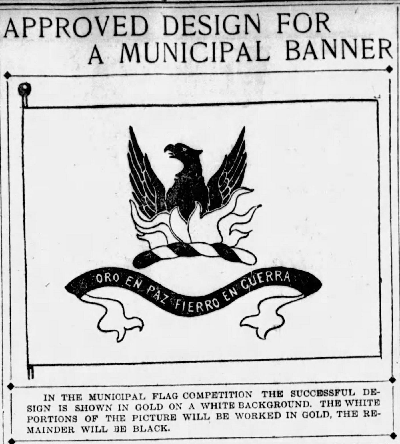
In 2003, NAVA identified the following as the design of “[t]he original city flag”:
But comparing this to the images of the Aitken-designed San Francisco flag (from the Dobbin album and the October 1929 Overland Monthly) and to the much busier current design—a design that, as we’ll see shortly, emerged from a Board of Supervisors’ flag project of 1938–1940 — indicates that the design above must be of an intermediary flag that reflects a significant redesign between 1929 and 1940.
Specifically, at some point during this decade, the black, upswept phoenix of the 1900 flag was replaced by the first version of the yellow-beaked, brown, and more traditionally heraldic figure whose contemporary incarnation we see on today’s flag.
Also during this period, the organic, curvilinear gold flames of 1900 were reconceived as an early version of the angular red-with-a-gold-border “crown” graphic of today. The torse was fused to the base of the flames, as in John Gamble’s concept sketch of 1900, rather than being suspended between the flames and the motto, as it was in the Aitken design.
Additionally, the motto ribbon “reverted” to the two-tiered, three-segmented concept shown in the Municipal Reports of 1899–1900, with the motto now in gold letters on a black-outlined white ribbon rather than on a solid black ribbon.
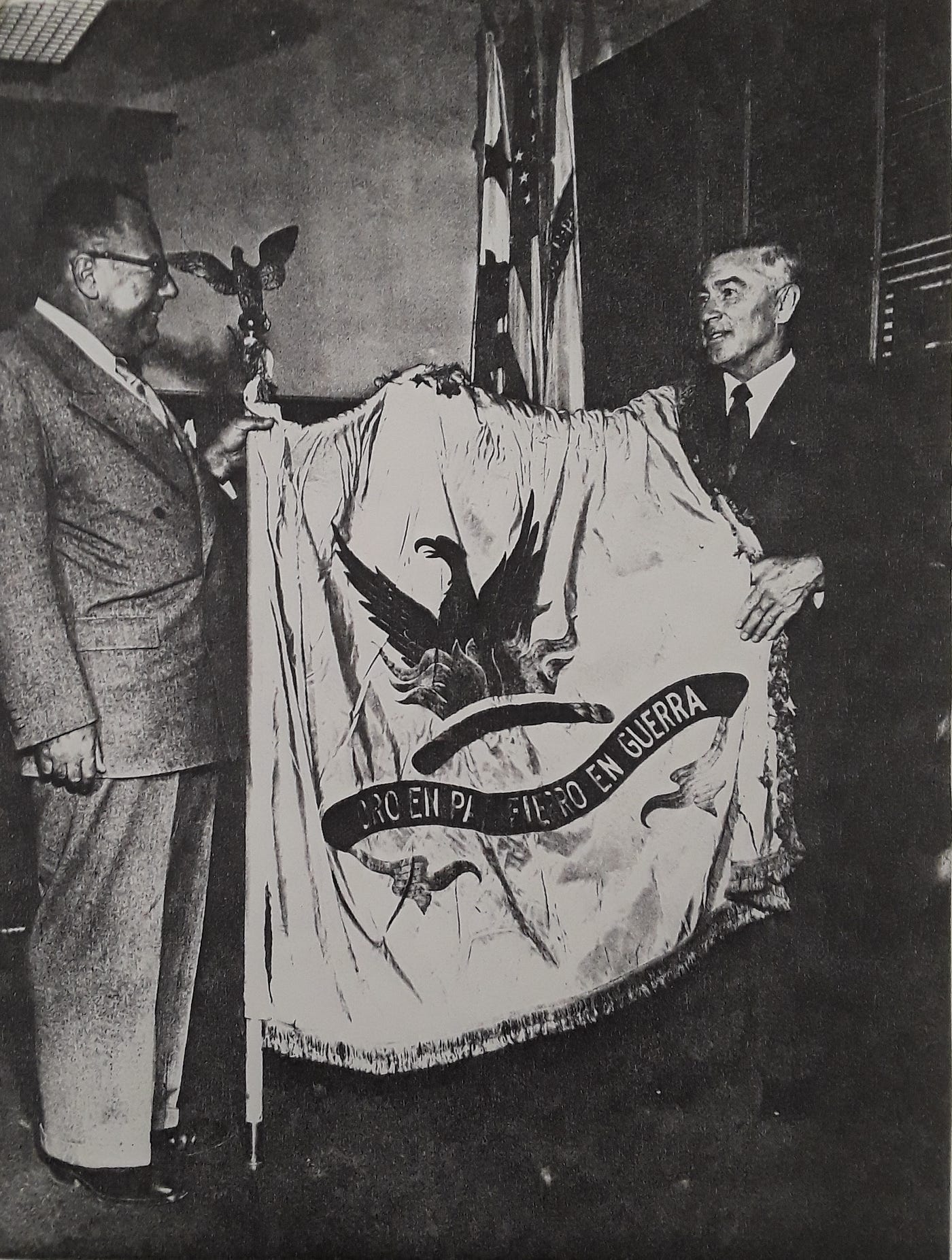
It appears that this new direction had already been put in place by late 1931.
On October 23, 1931, the San Francisco Chronicle published a photograph (below) of a ceremony that had taken place the day before in Mayor Angelo Rossi’s office at City Hall. Rossi had been appointed Mayor and inaugurated in January 1931, to serve the remainder of the term of Mayor James “Sunny Jim” Rolph, who had just been elected Governor of California.
At the ceremony, the San Francisco Chamber of Commerce presented Rossi with three flags: national, state, and municipal. The San Francisco flag is on the left. And whatever else this is, it’s not the Aitken design. Rather, it’s a step—perhaps even, as we’ll see, a rather advanced step—towards supplanting the Aitken design and putting the city on the path toward the current flag.
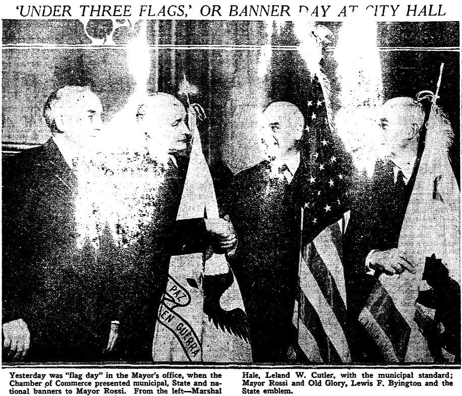
It appears that this San Francisco flag is the one that was behind Rossi (the leftmost of the three flags in the wall-mounted pedestal) in the following photograph taken in his City Hall office on January, 8, 1932—Inauguration Day, following his being properly elected in November 1931.

Here’s the detail:
The October 1931 article in the Chronicle had noted that during the flag presentation event, Rossi was also gifted the oak pedestal carved by local sculptor P.O. Tognelli “under the direction of C.H. Sawyer, city architect.” The participation of the city architect could be a tell as to how “worked out” the quiet redesign of the city flag was.
A sidebar: To modern sensibilities, the most obvious custodian of San Francisco’s official municipal flag would seem to have been the Board of Supervisors. But, in 1900, Mayor Phelan set — and, in 1929, Mayor Rolph followed — the precedent of making the police department the steward of the physical flag.
This may have reflected an earlier belief that the city flag would be used only on those public occasions when it was part of a police color guard. At the same time, the public effect of Phelan’s and Rolph’s actions may have been to advance the notion that the flag and its design were the prerogative of the Mayor or even the police department.
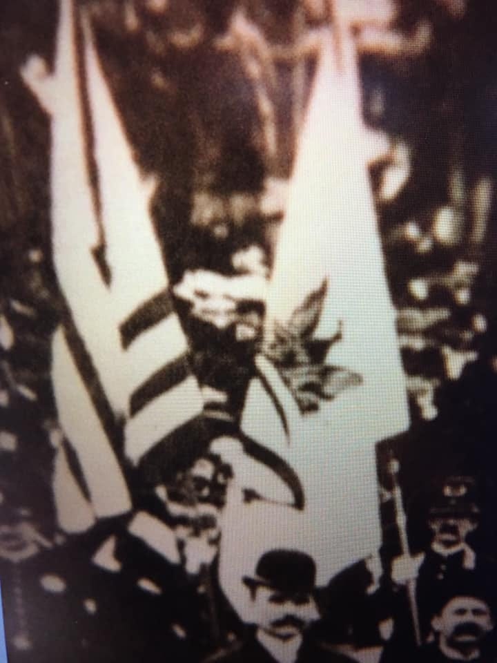
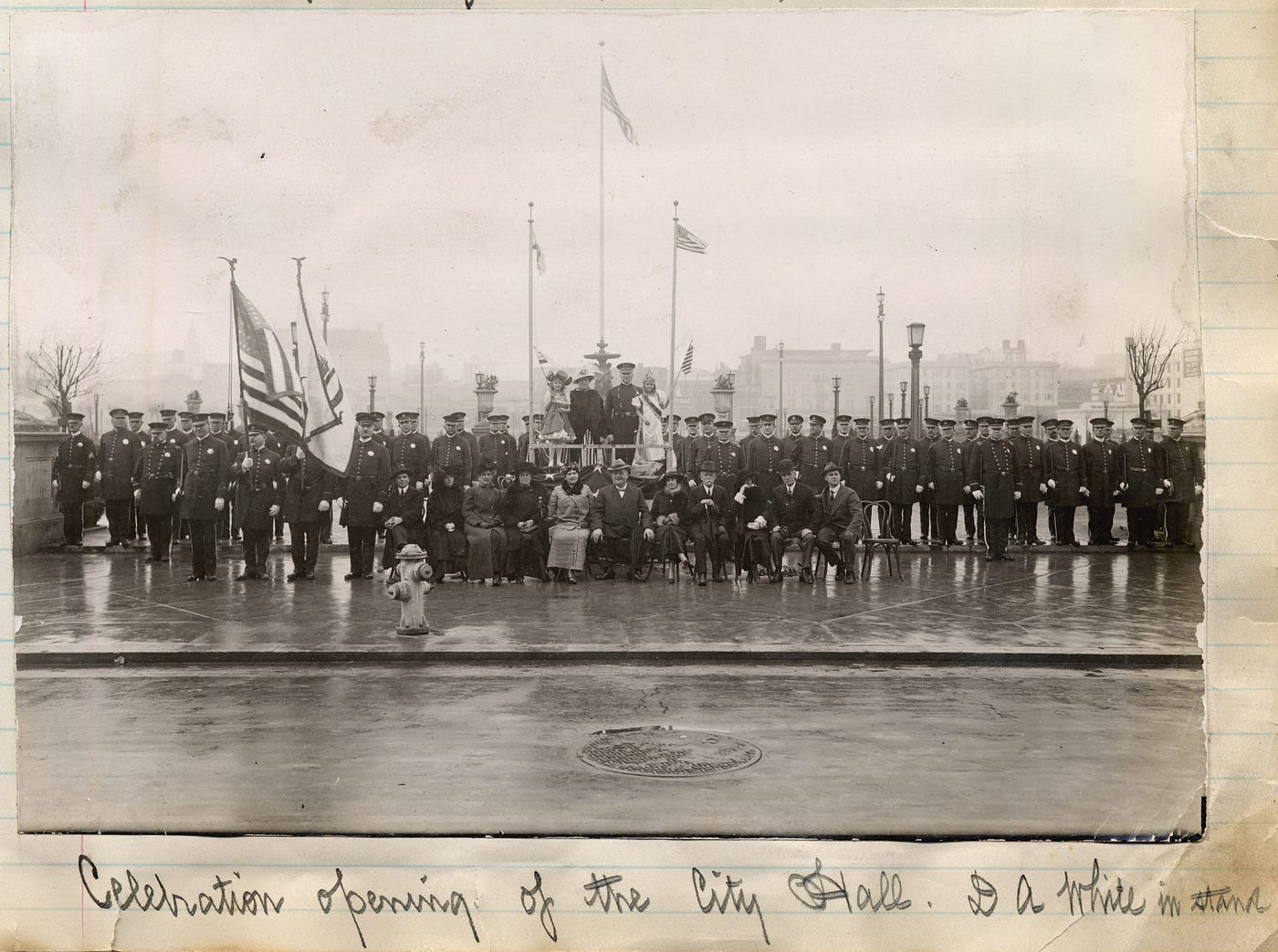
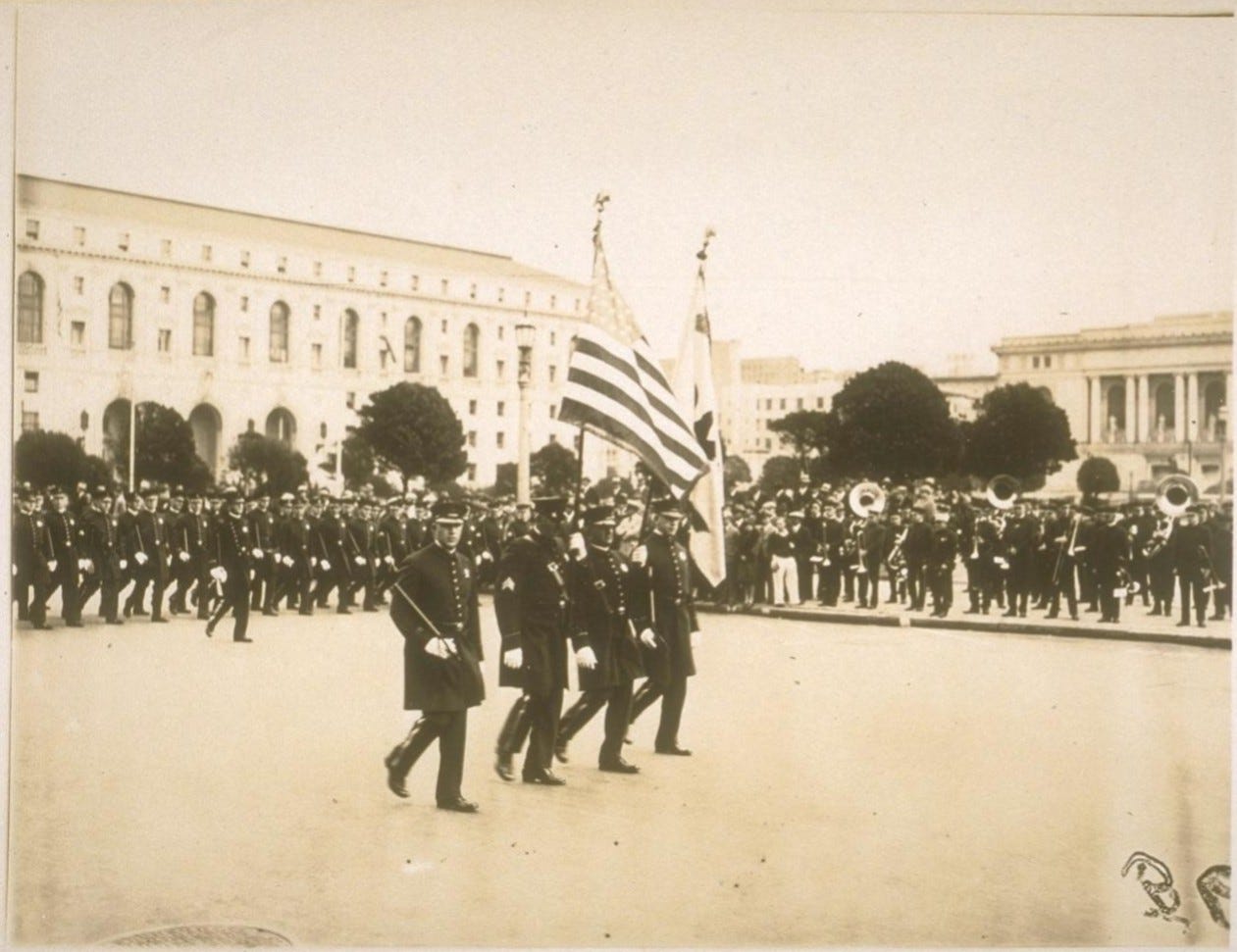
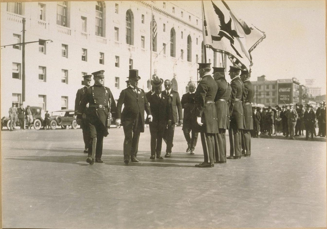
Below is a rare photograph showing the original 1900 San Francisco flag in situ — and with police escort — at the December 28, 1915, dedication ceremony for the nearly completed new San Francisco City Hall. A main focus of the opening was that Rolph was moving into his new office.
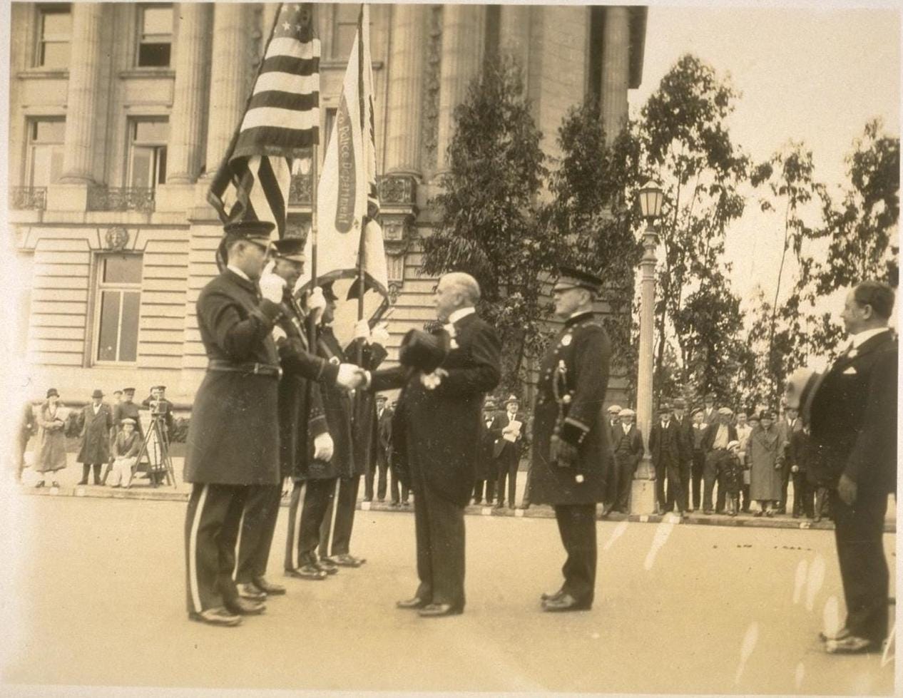
The Aitken-designed San Francisco flag of 1900 continued to be used for a few more years. Although it’s a little hard to make out, the photo below shows the flag being hoisted during the annual S.F.P.D. inspection and review at City Hall on October 30, 1920.
But, by the time of a similar annual police ceremony that took place at City Hall in November 1928, there is a noticeable change.
The late 1920s, recall, is the period when the original San Francisco flag fell into disrepair. There are only two flags in this photograph. At a glimpse, one almost can imagine that the one on the right is the original flag and that the “San Francisco Police Department” ribbon is a patch.
But, the following photograph from the same November 1928 event makes it clearer that this is not the Aitken-designed flag of San Francisco. Both the phoenix figure and the motto ribbon below are of a different shape.
Either way, it appears that there was no San Francisco city flag at this event.
Here’s a photograph that was taken a little more than two years later, during Angelo Rossi’s first inauguration as Mayor, on January 8, 1931. This was more than a year after the photograph of the replacement copy of the original San Francisco flag appeared in the Overland Monthly in October 1929.

The four flags are, from left to right: two American flags, a San Francisco Police Department flag (possibly the same one as in the 1928 photos above) and a San Francisco Fire Department flag. No San Francisco city flag.
Here’s the detail of the S.F.P.D. and S.F.F.D. flags:
Note that the winged figures on these flags appear to be quite different—and more eagle-like—than the phoenix on the original city flag. In fact, these “birds” appear to be very similar to the one on the city flag that the Chamber of Commerce gave to Rossi nine months later, in October 1931 (see photo above).
Think about what was happening in the United States and the world in the late 1920 and early 1930s—specifically, the onset of the Great Depression; the consolidation of power of the Communist and Nazi parties in Germany; and the rise of Hitler. It wouldn’t be surprising if there were those in San Francisco —perhaps including influential members of the city’s prosperous Jewish business community—who came to find Aitken’s phoenix too “Teutonic” and who thought that what the San Francisco flag needed at that time was a more obviously “American” phoenix.
If so, those people might have found visual inspiration in a flag the San Francisco Fire Department had started using at least fifteen years earlier—when the police department still was toting the Aitken-designed city flag at ceremonial events. The following photograph shows James Rolph, who was Mayor from 1912 until 1931, helping to dedicate a new engine house at Commercial and Drumm Streets on July 20, 1915.
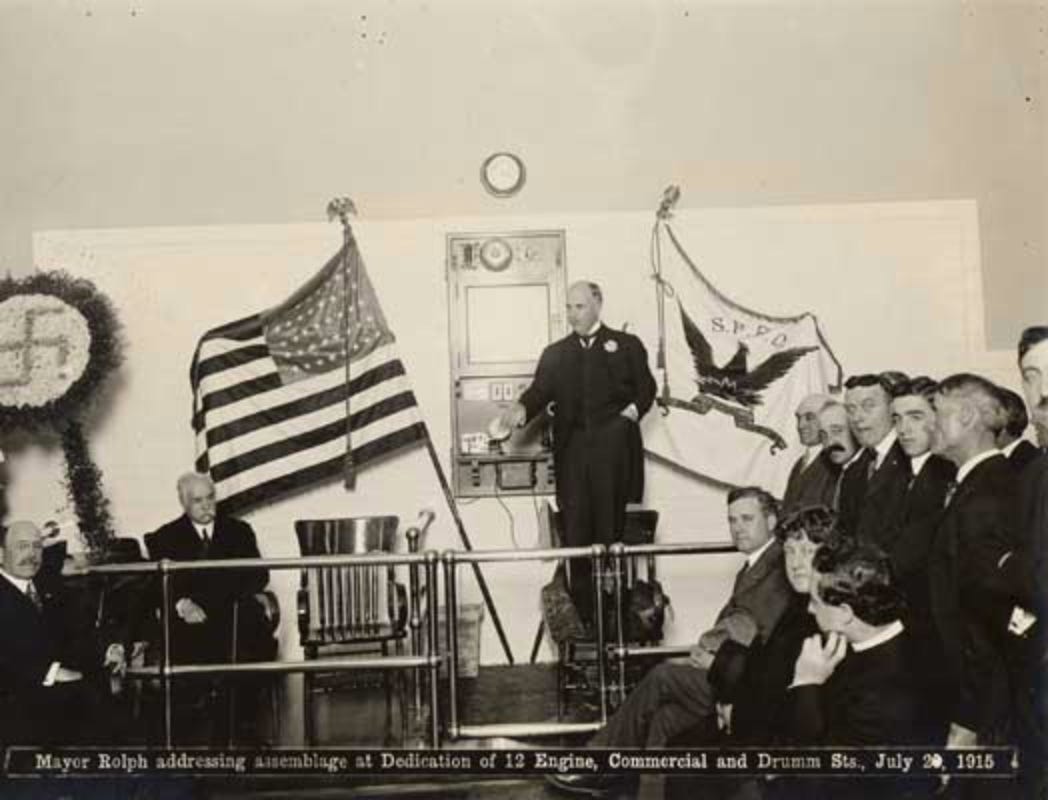
Except for the initials “S.F.F.D.”, the fire department’s flag, on the right, appears very similar to the one the the city began using in the 1930s.
But, already by 1918, the San Francisco Base Hospital had followed suit.

And, by the time of the annual S.F.P.D. City Hall review of 1923 (below), the police department had adopted the same iconography for its flag. So, by the time of the mayoral inauguration of Angelo Rossi in January 1931 (shown above), the S.F.P.D. had been using a flag different from the city flag of 1900 for nearly eight years or more.
The S.F.P.D. is carrying the same flag in this undated photo from the 1930s or 1940s.

One can see how, over the course of 20 or so years, various San Francisco institutions—including the City itself, apparently—adopted the S.F.F.D. flag as their own.
Were the San Francisco Fire Department and, later, the San Francisco Police Department and the San Francisco Chamber of Commerce, the mechanisms by which Aitken’s phoenix and, indeed, his entire San Francisco flag design was ushered off the stage?
Worth noting: By the dawn of the 1930s, San Francisco and its citizens had yet to adopt the cultural practice of flying the city flag from rooftops and tall poles. If any official flag was flown, it was the national one. Which likely meant that most San Franciscans wouldn’t have had a clear mental picture of what the San Francisco flag actually looked like.
All of this, taken together, could have made it easier for any mayor during this period to slip in a new city flag with little due process and little risk of public notice or objection. Even better, from a PR standpoint, to have the cover of being able to frame this new flag as a gift from the Chamber of Commerce — a gift which nonetheless meant that every single person or group meeting with the mayor in his office would see this, not the banner sitting in a drawer at the S.F.P.D., as the official San Francisco flag.
As to that city flag of 1900: There’s no evidence that it was used by any city institution other than the police department. And, as we saw, it appears that the police had set this flag aside in favor of a new one at least by 1923. So, it begins to look like the copy of the Aitken flag made in 1929 was produced — by whom is unclear — primarily for historical/commemorative purposes.
One question this leaves hanging: Who set the wheels in motion for the new San Francisco city flag design that started being introduced in the early 1930s? Who was it who originally felt so strongly that the black, gold and white Aitken flag was unacceptable that they were prepared to say so and push for a change?
Was it Angelo Rossi? The Chamber of Commerce? The S.F.F.D. and S.F.P.D.? Was it even James Rolph, who was Mayor when the fire and police departments adopted their new flags?
Or was it one or more behind-the-scenes influencers?
A telling footnote before we continue…
The following beautiful poster was produced, apparently by the Native Sons of the Golden West, for the Semi-Centennial Admission Day Celebration that was held in San Francisco September 8–11, 1900. The poster features—just to the right of the pedestal, and above the bear—what would have been one of the earliest published artistic renderings of San Francisco’s new city flag.
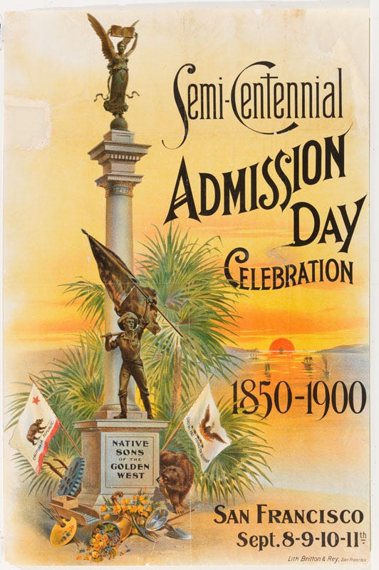
This poster would have been created only a few months after the new city flag design was announced on April 15, 1900, with Mayor Phelan presenting the flag itself to the S.F.P.D. at a May Day ceremony two weeks later.
But, although the city flag in the poster has most of the basic elements of the new flag, the depiction is quite different.

Among the departures from the recently adopted city flag:
- The phoenix is a more traditionally heraldic eagle figure, and it is rendered in tones of brown and gold rather than black.
- The flames, rather than being monochromatic gold, have orange tongues.
- The motto floats as black text on the white field, rather than being set in gold on a black ribbon.
One possibility is that the phoenix of the flag in the poster is a colorized riff on the phoenix depicted in the official seal of the City and County of San Francisco, adopted in 1859 (see above).
But, whatever the inspiration for this depiction, it carries that suggestion that the Native Sons of 1900 didn’t much care for the specific city flag design that had just been adopted.
A decade later, the following 1911 postcard for the 1912 mayoral campaign of “Sunny Jim” Rolph featured, at the top left and top right, the iconography of the San Francisco city and California state flags.
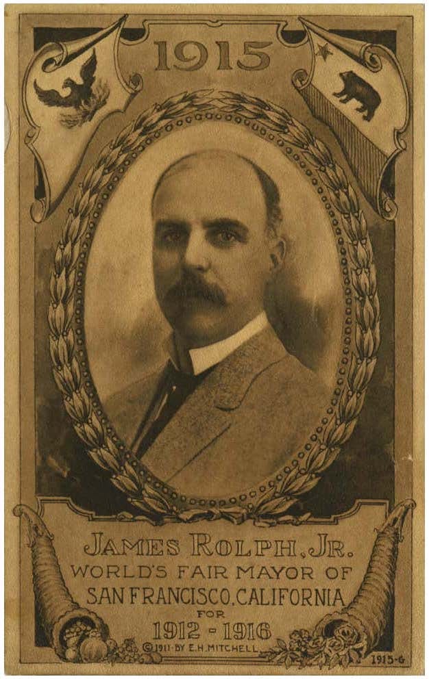
But, clearly, that’s not Aitken’s phoenix at the top left. As in the earlier Native Sons poster, Rolph opted for a more heraldic spread eagle.
Both of these examples could be seen as evidence that, although the S.F.P.D. toted the Aitken flag at ceremonial events for 20 years, there was resistance to that specific design from the beginning.
The Native Sons depiction, in particular, could be regarded as a nascent version of the flag adopted by the S.F.F.D. by 1915; the S.F.P.D. by the early 1920s; and the City itself — or at least the Mayor’s office — by the early 1930s.
Fast-forward to 1938.
That’s when elected San Francisco supervisor and self-appointed vexillologist Dr. Adolph E. Schmidt — who also was chair of San Francisco’s City Beautiful Committee — decided that what the new San Francisco flag most needed was the name “SAN FRANCISCO” emblazoned across the front.
In fact, this idea was originally proposed and championed by the recently formed San Francisco Women’s Chamber of Commerce, a group that had convened itself and incorporated only a year earlier, in July 1937.
In the spring of 1938, in anticipation of the upcoming influx of tourists visiting the Golden Gate International Exposition starting in early 1939, Schmidt spearheaded a campaign to install missing street name signs at traffic intersections and urge all residents and business owners to install electric lighting to illuminate their house and building numbers. He secured the support of the Women’s Chamber of Commerce as his partner in organizing and promoting this months-long effort.
The women’s group, for its part, was beginning to broaden its portfolio of activities beyond the arena of commerce and industry to include organizing and producing large-scale “civic pride” parades and demonstrations, which — given the emerging Nazi and fascist threats during this period — came with a heavy dose of patriotism. It was against this backdrop that these businesswomen were determined that in order to be an effective symbol at such events, San Francisco’s flag needed a branding upgrade, something that no doubt dovetailed with Schmidt’s interests.
Indeed, it’s not difficult to imagine that Schmidt’s support of the women’s flag proposal was a negotiated favor that he happily returned in thanks for their support of his beautification project.
Too: It appears that, by the late 1930s, a number of City institutions—including the City itself—were using flags that all looked the same. Was the City the only one that did not have its name on the flag? If so, this might have helped to advance the idea that the City needed to have its name spelled out.
So it was that, in August 1938, Supervisor Schmidt introduced a resolution that stated, in part [emphasis added]:
Whereas, many have marveled at the beauty of the Official Flag of the City and County of San Francisco and have inquired “What flag is it?” because there is no wording to show; now, therefore, be it
Resolved, that there be added to the Official Flag of the City and County of San Francisco the words “San Francisco” so that it will be identifiable to all who will view it; and be it
Further Resolved, That the words “San Francisco” be placed horizontally along the lower portion of the Flag, below the Phenix [sic] and the Motto, in letters of appropriate size, rich blue in coloring, so that the Flag will be blue and gold on a field of white, symbolic of the blue skies of San Francisco, the gold of her commerce and industry and the white of her pure purpose to be a city of happy homes and contented, prosperous people.
Quite a rationalization.
Of course, it passed.
Two years later, in December 1940, the Board of Supervisors passed an ordinance, likewise championed by the Women’s Chamber of Commerce and introduced by Schmidt, that codified the 1938 resolution and — for the first time — the design of the flag more broadly.
The ordinance specified [emphases added]:
A Phoenix rising from the flames, below which shall appear the motto “Oro en Paz — Fierro en Guerra,” both in a golden hue on a field of white, with the flag itself bordered with gold.
The words “San Francisco” shall appear horizontally along the lower portion of the Flag, below the Phoenix and the Motto, in letters of appropriate size, rich blue in coloring.
Apparently, the poorly drafted, imprecise phrase “the flag itself bordered with gold” was meant to refer to the narrow gold banner-edging fringe that had been used for many years. But the phrase was misinterpreted to mean a thick picture-frame border on the banner — significantly reducing the size of the “field of white” specified immediately before. “Appropriate size” was interpreted to mean the largest, most crass block letters that could fit in the allotted space.
So we went from this

to this, which appears to have been in use at least as late as 2003:
This flag, originally made by the Paramount Flag Company in San Francisco, is known as the “Paramount design.”
There was, at the time, one other flag maker in San Francisco. The Emerson Flag Manufacturing Company produced its own version of the new flag:
Emerson took a slightly different approach to the iconography. The phoenix has different feathering, shows no tongue, and squints its eye. The flames are rendered as overlapping tongues of red, orange, and gold, the organic, curved shapes of which recall the flames of the original Aitken flag of 1900. The motto is in black lettering on a gold ribbon. Contrasted with the bright blue, sans serif “SAN FRANCISCO” of the Paramount design, “SAN FRANCISCO” here is darker blue and in a serif font. (Based on the general shape of the phoenix, the expression of the flames and the color scheme of the motto ribbon, it’s a good guess that Emerson made the S.F.F.D. flag shown in the 1915 photo above.)
In effect, the Paramount design “won” when San Francisco Mayor George Christopher in 1963 described this as the official design.
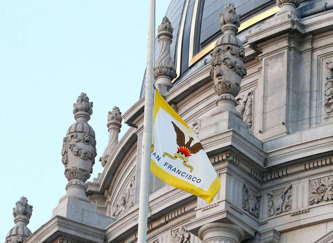
By 2008, an update of the Paramount design reflected a further cartoonization of the phoenix. This version of the flag — shown atop City Hall in the photograph below from 2008—keeps the phoenix’s mouth open but “puffs” the beak, deletes the tongue, and squints the eye. And, its feathers have less detail.
Also in this version, all the graphic elements are larger, occupying a higher percentage of the white field. The “SAN FRANCISCO” font appears to remain the same size. But the kerning — the space between the letters — is opened up, so that the name, which was more narrowly centered in the previous version, takes up most of the width of the white field.
A dedicated page on the website of the City Attorney of San Francisco features a detail from a June 2015 photograph of what appears to be this same physical flag, faded after another seven years in the sun.
The photo detail is displayed below the header “The official flag of the City and County of San Francisco.” (The official name of the flag is “The Flag of San Francisco.”) There is no textual description, which suggests that the photo is intended or assumed to be self-explanatory.
This is the closest thing that I’ve seen to a City sanction of a specific artistic interpretation of the design that was broadly codified in 1940.
Most likely, though, no such sanction is intended. By December 2017, another photograph of the San Francisco flag at City Hall suggested that the previous faded flag had been retired from duty. The new flag was similar in some respects but different in others, preserving certain aspects of the Paramount design but incorporating other aspects of the Emerson design: the motto ribbon now was gold with black lettering rather than black-outlined white with gold lettering; and the flames were rendered as interlocking curvilinear tongues in red, orange and gold rather than as a stylized, geometric “crown” in red and gold.
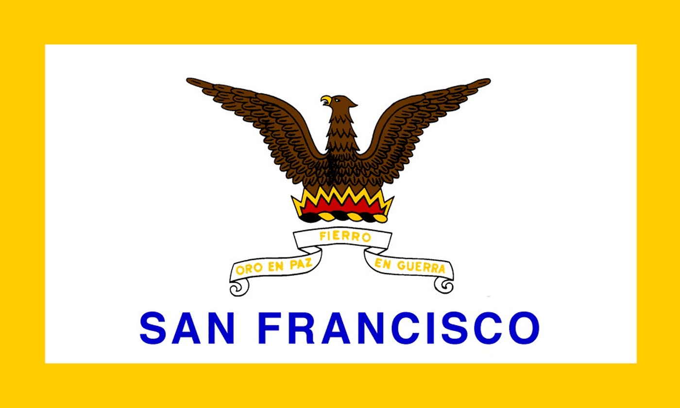
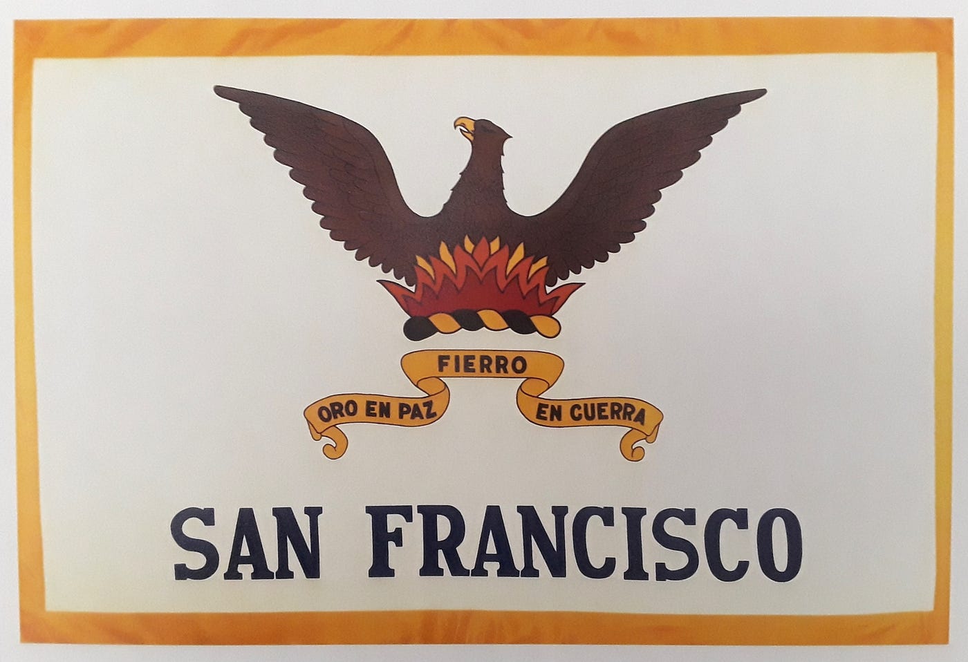
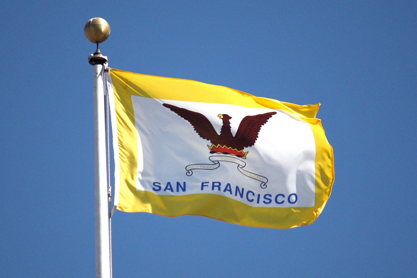
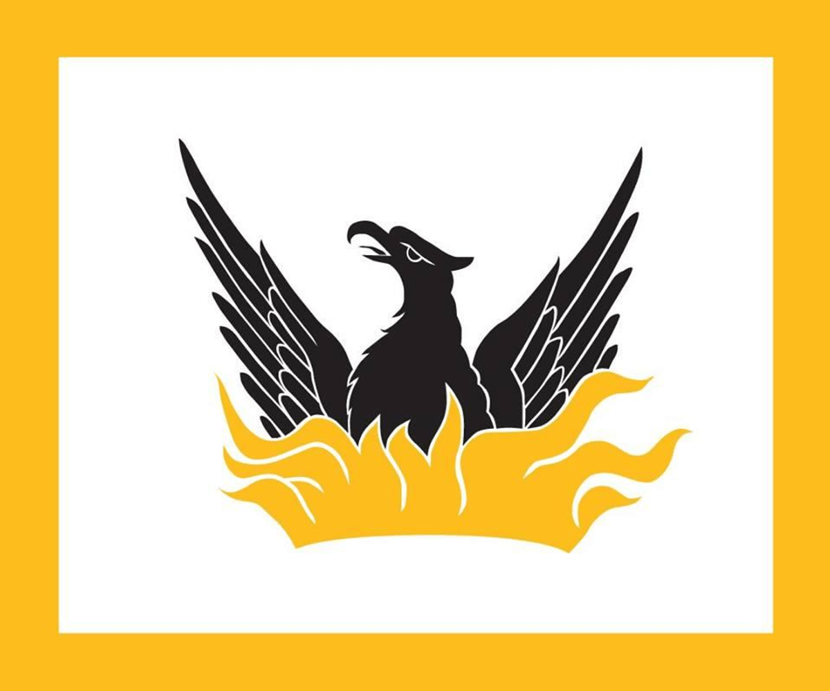
The version below, which I introduced at the top of this essay, was created for commercial purposes—and independent of San Francisco city government—in 2005. This version closes the phoenix’s beak and eyes in a way that makes the creature look snooty, and it makes the feathers fewer, fatter, and even less detailed, the effect of all of this being to make the bird look like it would be most at home on a Saturday morning kids’ TV show.
The “flame crown” here is mostly red, with a thinner gold border. The heights and widths of the “peaks” are asymmetrical in a way that makes it hard to tell if the unevenness is intentional or just poor design.
The torse — an element of every design and version since 1900 (and earlier, if one includes the 19th-century flag(s) based on the San Francisco seal of 1859) — has been removed, possibly because the artist didn’t know what the torse was or how it has functioned in the historical evolution of the flag. (Worth noting: The torse is the one symbolic element that is not mentioned in the Board of Supervisors’ flag ordinance of December 1940—making this the symbol easiest to jettison by those who don’t know their history.)
Also, the “SAN FRANCISCO” font — already pretty big in previous versions — is even bigger and heavier, no longer arguably a supporting player in the design but now decidedly a lead actor opposite the phoenix. The kerning is tighter than ever to squeeze the letters into the available space, and the shade of blue has been darkened from sky to S.F.P.D.
In 1938, Supervisor Schmidt noted that the San Francisco flag was recognized for being “beautiful in artistic design and coloring,” and he used this as the reason why the city should take credit for that by adding the text “SAN FRANCISCO” across the front of the flag.
But, in adding “SAN FRANCISCO,” a thick gold border, and yet another color (blue) to the two (brown and red) the Mayor’s Office had “socialized” with the new flag that it started using in the 1930s, the Board of Supervisors created a fundamentally different flag — one that actually wrecked the very “beauty” that the city fathers said they wanted to celebrate.
Consider: The majestic black-and-gold dome of today’s San Francisco City Hall is a rendering, in three dimensions, of the city’s Spanish motto, which translates to “Gold in Peace, Iron in War.” The original city flag of 1900–1929 forged a similar connection with its simple black-and-gold motif. But no one looking at today’s flag would be able to tell that San Francisco’s official colors are black and gold.
No longer reflecting a single vision and exhibiting the simplicity and dignified restraint that Robert Aitken brought to his design of the original flag — and that is the hallmark of all great design — San Francisco’s flag now was, and remains, a retrofitted kitchen-sink assemblage of features that kind of hold together but not really.
Further reflecting the city’s carelessness about its flag, any design standard that may exist for the flag is barely enforced, if at all. Note the (few) flags that you see around San Francisco and you’ll start picking up on inconsistencies.
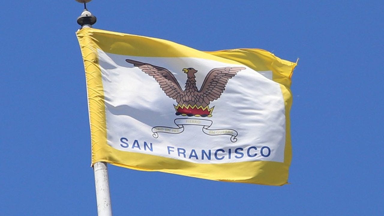
In large measure, this is because even though the most readily available commercial version of the San Francisco flag is from 2005, at least two other, different versions — the one from circa 2008 and the Emerson flag from the 1940s — are being flown and used around the city.
No municipal fines are levied for flying unhistorical “marketplace” versions of the flag. And there don’t appear to be any local government incentives for flying an “authorized” version.
Here’s a version of the flag that is not even consistent within itself. It’s a mashup that uses the phoenix and “SAN FRANCISCO” from the circa 2008 flag and the flames and motto color scheme from the 1940s Emerson design:
The San Francisco flag is, quite literally, all over the map.
One of the most inscrutable aspects of the design evolution of the San Francisco flag is the central figure of the phoenix.
Of course, the root question is why does San Francisco continue to represent itself with the cartoon on the current flag?
But it’s the answers to these other design-historical questions that may point us toward a better San Francisco flag:
- Who decided, and when, and why — apparently as first reflected in the new city flag that the San Francisco Chamber of Commerce presented to Mayor Rossi in October 1931 — that the original upswept phoenix should change to the more traditional heraldic posture of the phoenix in the flags the S.F.F.D. and S.F.P.D. had been using for a decade and more before that?
- Who decided, and when, and why — sometime around 2008 — that the beak and eyes of the phoenix should change from open to closed?
- Who decided, and when, and why — again, apparently as first reflected in the flag the Chamber gave to Rossi in 1931—that the color of the phoenix should change from black with details simply articulated against the white field to brown with black outlines and a gold beak?
As to this last question, for all the attention that the 1940 ordinance paid to the colors of every other aspect of the San Francisco flag, it’s odd that the ordinance specifies no color(s) for the phoenix, which had been changed — presumably with some intention — from black to brown within just the previous decade, having been black for the 30-plus years before that.
It’s not difficult to imagine that the earlier shift to a brown phoenix was meant to echo the brown bear of the California flag, which had been adopted in 1911.
For me, though, the original black phoenix of 1900–1929 is a powerful symbol indicating that even a reborn phoenix still bears the marks and memories of the flames and what was lost in them.
Everything San Francisco needs to make a great city flag was there between 1900 and 1929 — before politicians started putting their noses in.
Imagine the following 1900 San Francisco flag:
- A white field.
- A gold fringe.
- A black phoenix.
- Gold flames.
- A black-and-gold striped torse representing fire and ash.
- The city motto in gold letters on a black ribbon.
Perhaps a modern-day riff on this would make the black-and-gold iconography and text a little larger relative to the white field.
Perhaps this 1900 phoenix — which is simpler, more stylized and more, well, modern than the cartoon phoenix of the current flag — would find an even more elemental expression.
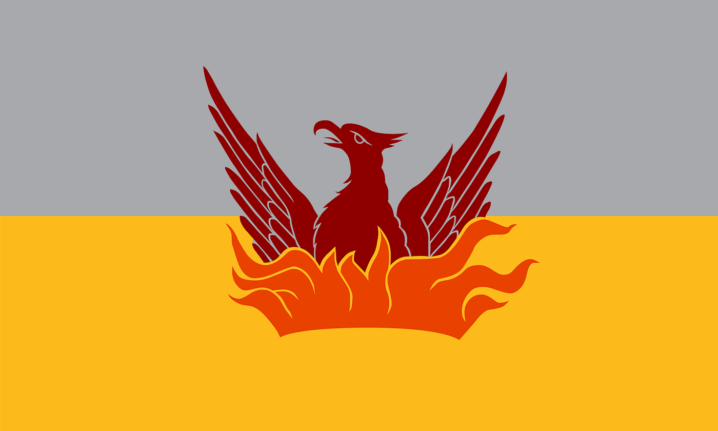
Shortly after hearing Roman Mars’ 2015 TED Talk, San Francisco urbanist and planner Brian Stokle set out on what has become a five-year (and counting) quest to design a better San Francisco flag. Last June, as part of this project, Stokle produced this rendering of what an updated version of Robert Ingersoll Aitken’s original 1900 flag might look like:
In December 2019, staying with Aitken’s iconography, Stokle unveiled what he calls the Fog and Gold flag (below). He recently kicked things up a gear by selling a physical version of this flag, which is starting to fly in neighborhoods across the city. In April 2020, the San Francisco Chronicle profiled the effort.
You can learn more about the Fog and Gold flag in Stokle’s blog post here, and you can buy one here.
I prefer the following “inverted” alternative version of the Fog and Gold flag, which Stokle created in June 2020. For me, this version nicely captures the fact that fog always hovers closer to the ground, with the sky and sun above. It also effectively speaks to the the hopeful, optimistic “phoenix narrative” in which the mythical bird rises from the ashes—darkness moving up into the light, death to rebirth.
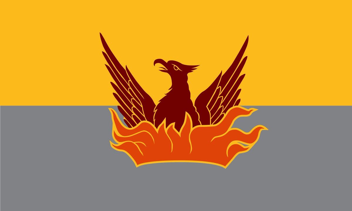
What these latter-day reimaginings of the original 1900 San Francisco flag show us is that the original flag is a great flag.
It’s a better design than the current San Francisco flag.
It’s cooler than the current flag.
And it makes for an awesome T-shirt.
For 80 years, San Francisco, one of the world’s great design cities, has had to endure a politically bungled flag design. That’s 80 years too long.
San Franciscans, let’s go back to the future! One way or another, let’s bring back the city flag of 1900!
Update, November 2022
Recently, Brian Stokle flagged a brief review of his Fog and Gold flag design. The August 2022 review is by Hamish Lawson, a vexillological observer in Scotland.
Lawson had read the present article. And, in the course of a follow-up exchange, he shared with me the following variation on Stokle’s design that I think takes the design a few important steps forward.

Lawson agrees with me — for much the same reasons — that the fess (band) colors of the Fog and Gold design should be reversed, with gold on top.
He changes the phoenix “back” to black—as it was in Robert Ingersoll Aitken’s San Francisco flag of 1900, where this phoenix first appeared. In addition to making the phoenix “pop” much better, especially against a gold backdrop, the play of black and gold keeps the City motto, “Gold in peace, Iron in war” in the mix—metaphorically, at least. And, it expresses the City’s official colors: black and gold.
Lawson changes Stokle’s fess “split” from 50/50 to ⅔-to-⅓, with the narrower, gray fess on the bottom. This accomplishes a couple of things.
First: It’s more graphically satisfying. Scroll back up and pay close attention to how the fess colors and partitions interact with the phoenix and flames in the current Fog and Gold designs. Stokle has tried very hard to make a 50/50 split work. But, it’s forced—and, on close inspection, that shows.
Lawson allows the fesses to split more naturally. The result is that “phoenix and flames” (a) reads as a more unified icon that (b) is anchored rather than floating—and that truly “nests” in the lower fess. What shines through from “behind” the phoenix and flames is one color—gold—and there is no horizontal line that interrupts, or breaks into, the iconography.
Also: The narrower gray fess reads better as a ground “layer”—which is what fog is.
Stokle has responded with the following:

Two things to notice here:
- The fess split is 62/38 — narrower on the bottom and wider on the top, but with a slightly lower differential than Lawson’s suggested ⅔-to-⅓.
- Stokle stays with his own colorways — most notably, in the phoenix. As Stokle has continued to develop his design, including looking for the best color contrasts, the phoenix has become darker and more brown, i.e., less maroon-ish / wine-ish. Here, Stokle keeps the phoenix a very dark brown, rather than taking it all the way to black.
This is a strong design. I very much hope it will “win out” as Stokle’s “final draft” — and that it will find a toehold in the larger conversation about the next Flag of San Francisco.
The Bold Italic is a not-for-profit media organization, and we publish first-person perspectives about San Francisco and the Bay Area. We operate under a fiscal sponsorship of a 501(c)(3).
You can become a paid subscriber. Or donate. Or learn more about us.