
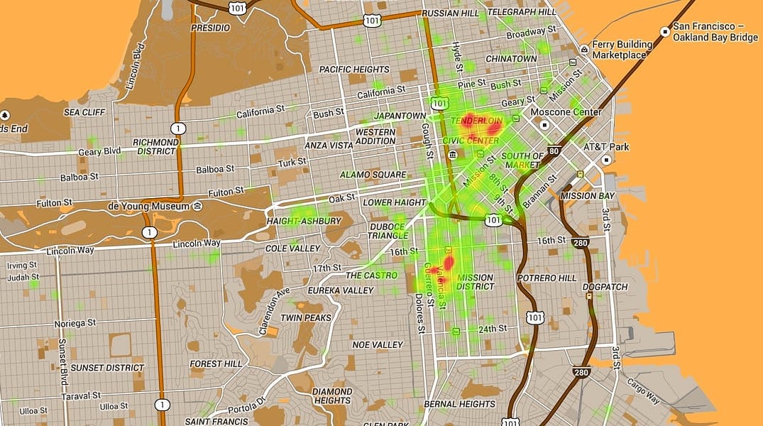
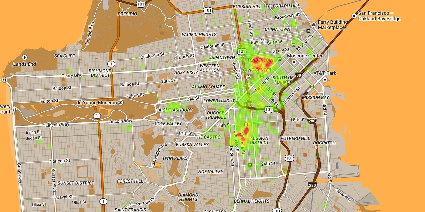
Back in November, Jennifer Wong’s (Human) Wasteland Map took the Internet by (shit) storm. As comprehensive as the original map was in terms of showing poop by location, it only represented about 4,000 data points from January to June of 2013, as supplied by Data SF. Until now! Haochi Chen has shared with The Bold Italic his new version of Wong’s map, which pulls in the latest data from the 311 database and allows more advanced filtering.
Chen says he was inspired by a recent Reddit post showing human waste cleanup at Civic Center BART. The new and improved map shows information on waste reported as recently as today, and you can choose between a heat map and a rather crude “marker” setting. As always, if you’re interested in learning more about San Francisco’s poop problem, you can read more about it here, and I recommend you check out what groups like Lava Mae are doing in the city to help remedy the less than ideal situation.
Got a tip for The Bold Italic? Email tips@thebolditalic.com
The Bold Italic is a not-for-profit media organization, and we publish first-person perspectives about San Francisco and the Bay Area. We operate under a fiscal sponsorship of a 501(c)(3).
You can become a paid subscriber. Or donate. Or learn more about us.