


Biggest understatement of the year: Covid-19 has changed our lives dramatically. Besides the massive toll on public health, the pandemic has upended our overall lifestyles. We all know it. We all feel it. To show just how much, I’ve pulled together five charts based on mobility data from Google and Apple, with a focus on the San Francisco Bay Area (where I reside).
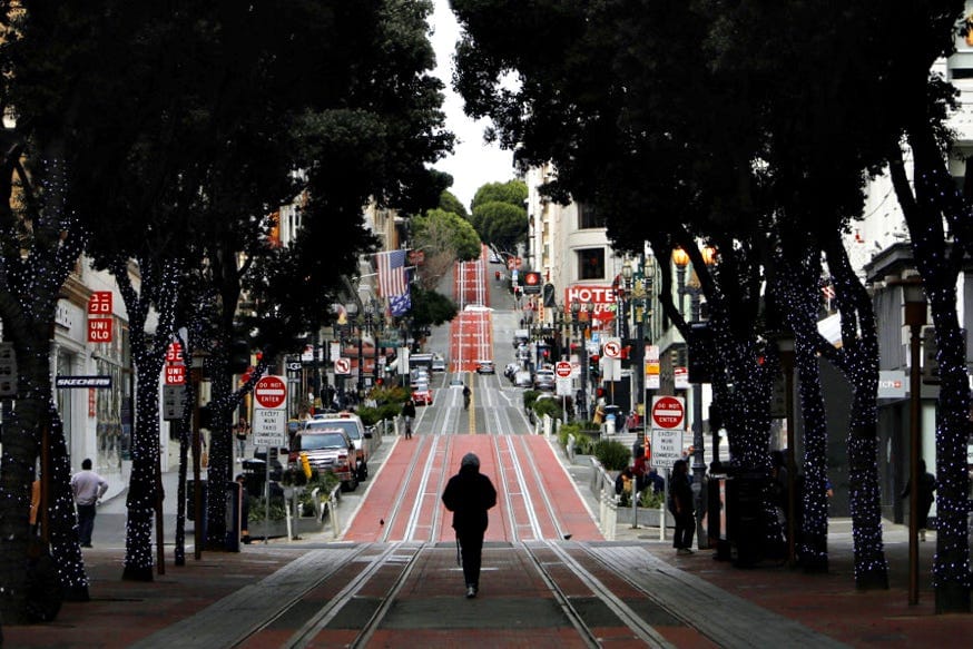
By “San Francisco Bay Area,” I’m including these nine counties: Alameda, Contra Costa, Marin, Napa, San Francisco, San Mateo, Santa Clara, Solano, and Sonoma.
Both Google’s and Apple’s mobility data show change from a baseline period, for a variety of mobility-related activities (going to grocery stores, going to work, etc.). Google’s baseline is the month of January 2020 (more precisely: January 3–February 6, 2020). Apple’s baseline is the day of January 13, 2020. The data indicate how much more or less an activity happens on a given day relative to the baseline period.
Sign up for The Bold Italic newsletter to get the best of the Bay Area in your inbox every week.
1. Yup, we’re spending way more time at home
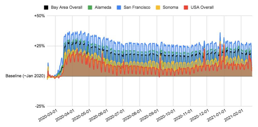
Since shelter-in-place kicked in for most of the Bay Area on March 17, 2020, the region as a whole (the black line in the chart) has spent on average 17% more time at home, compared to January 2020.
Not all counties experienced the same level of change. Folks in San Francisco saw the biggest increase, spending an average of 24% more time at home over the past year compared to January 2020. This is possibly because a relatively large percentage of SF residents have the luxury of working from home.
If we count only weekdays, that increase is larger, at +28%. (It’s likely larger on weekdays given during the non-pandemic period, people likely spent more time away from home during weekdays due to work. So in comparison, the increase in home time is more dramatic during weekdays than weekends. The weekday vs. weekend difference also explains the up-and-down oscillations in the charts.)
Out of all Bay Area counties, Sonoma, Napa, and Solano saw the smallest increase in home time: +12% overall on average, +14% if we only count weekdays. But even these counties saw a bigger increase than the nation as a whole, which has spent “just” +9% more time at home (+10% on weekdays only). My guess is this delta has something to do with the different professions that people tend to be in across various geographies, and how differently the pandemic has affected where people carry out those different professions. Tech workers, for example, are more likely to have regularly worked from an office pre-pandemic and have been able to work from home during the pandemic, so they experienced a relatively larger change in “home time.”
2. When we do get out of our homes, where we go has changed, too
3. Our trips to workplaces, transit stations, and retail/recreational businesses dropped the most
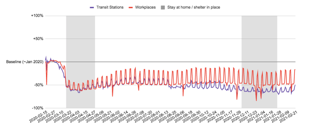
Not surprisingly especially in the tech-heavy Bay Area, we’re going to our physical workplaces much less. 42% less on average, actually, from when shelter-in-place started to now, and 51% if we count only weekdays.
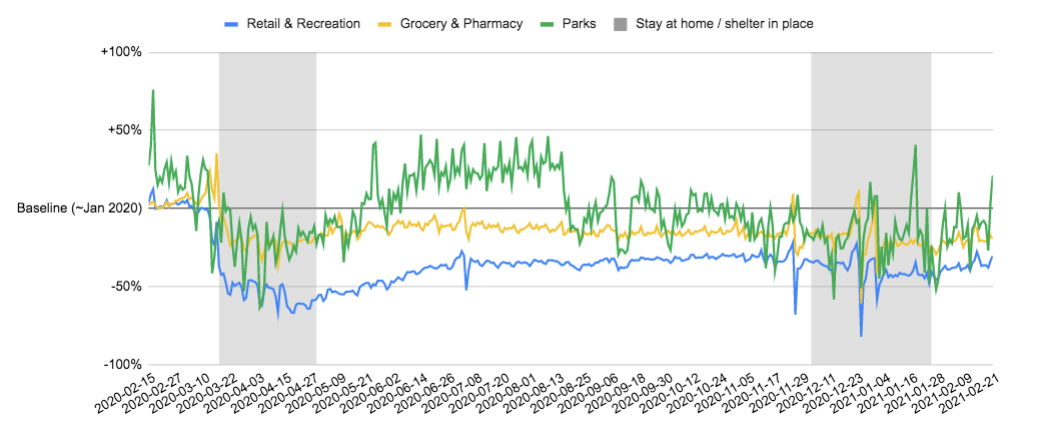
We’re also physically traveling to places like restaurants, cafés, shopping centers, theme parks, museums, libraries, and movie theatres (what Google calls “Retail and Recreation”) far less. This category experienced a 40% decline over the past year, compared to January 2020. Their online equivalents — Amazon, Netflix, DoorDash, etc. — are arguably the biggest winners of the pandemic.
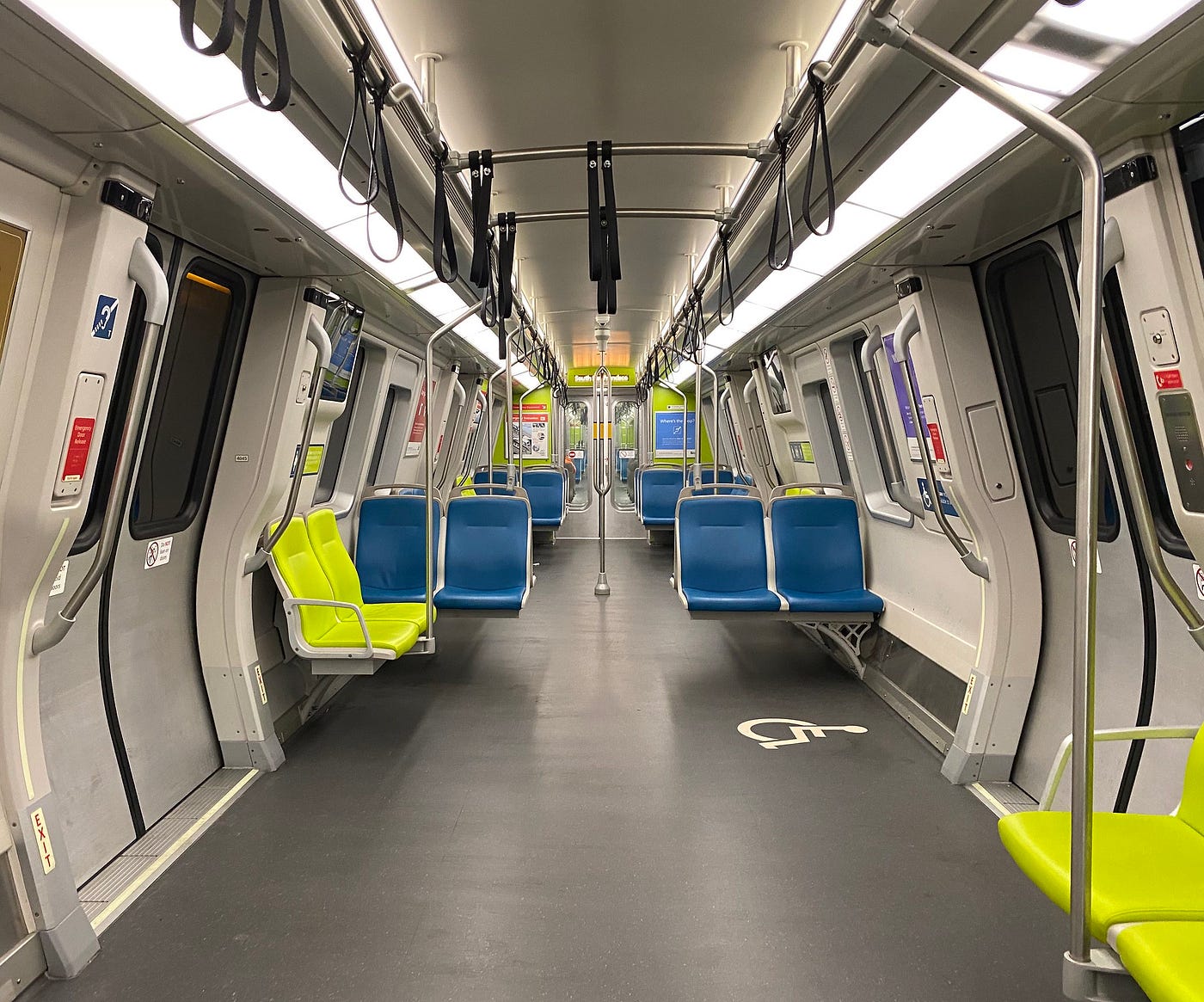
The biggest locational loser of Covid-19 is our transit stations.
We’ve been going to subway, bus, and train stations a staggering 54% less (56% if we look at only weekdays). BART concurs. Between January 1 and February 28, 2021, for example, BART reported an average ridership loss of 86% compared to the same time frame pre-pandemic.
Grocery stores and pharmacies experienced a relatively smaller drop in traffic (16% on average), probably because these services are essential. Parks saw an even smaller dip, only 3% on average since March 17. There were actually more visits to parks in the summer of 2020 versus the baseline. Some of this is likely due to seasonality: The baseline was January — cold and less fun to be outside, even in the moderate Bay Area weather. A lot of it is probably also due to an increased affinity for outdoor spaces given our other (indoor) options are much more limited during the pandemic.
4. We’re walking and taking public transit far less
We’re leaving our houses less, and when we do, where we go has changed. Turns out, how we go places has changed, too.
Apple’s mobility data reflects the transportation method (driving, transit, or walking) that people choose when looking up directions in Apple Maps. And my muscles ache from just looking at the results (or maybe from my lack of physical exercise, it’s unclear).
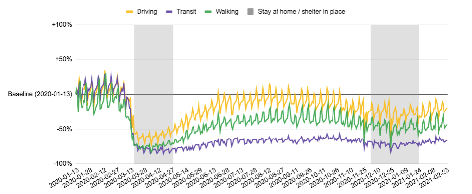
While driving as a transportation method returned to January 2020 levels during the summer and fall in the Bay Area, we stopped walking or taking public transit and never looked back. Well, not “stopped” completely, but certainly in that direction.
Between when shelter-in-place went into effect in most of the Bay Area to now, we’ve been walking 47% less. At no point over the past year — even in the glorious Bay Area summer season in October! — did we get anywhere near our level of walking from January (that’s winter! or “winter,” in Bay Area terms) 2020.
We’re taking public transit even less. We already alluded to this earlier, in how many fewer visits we’re paying to transit stations. According to Apple mobility data, we’re also looking at transit directions a whopping 70% less. Yup, those empty buses passing you on the street are the norm now, not the anomaly.
5. Bay Area vs. the USA
It turns out, though, the Bay Area is different from the U.S. as a whole (what else is new?) when it comes to these transportation method trends.
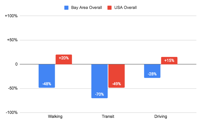
This chart is an apples-to-apples comparison of January 13, 2021, relative to January 13, 2020 (the baseline date in Apple’s data), to minimize the effects of seasonality. We can see that while the Bay Area is looking up walking directions a full 48% less on January 13 of this year vs. last year, the country as a whole is actually 20% more interested in walking.
The Bay Area also has contrarian views on driving: We’re looking up driving directions 28% less while the U.S. overall is looking up those same directions 15% more, on January 13, 2021, vs. the same day in 2020. This is not totally shocking, given that as mentioned earlier, the Bay Area has been staying home way more in general — and therefore has probably been looking up any kind of directions way less — than the country as a whole.
And it seems like everyone is looking up transit directions way less. 70% less in the Bay Area, 49% less across the country. Any way we look at it, the pandemic has clobbered our usage of public transit, not only in the Bay Area but nationwide.

Folks, our pandemic lives
And there you have it: just how much our lifestyles have changed, at least in the Bay Area.
Generally speaking, we’ve become homebodies who rarely leave the house. When we finally do, we’re avoiding workplaces and retail/recreational businesses, and we’re de-prioritizing walking as a transportation method.
Most strikingly, public transit has almost completely disappeared from our lives. As much as I hate crowded BART trains (and wrote a whole guide back in 2018 on how to avoid said crowdedness), as a public citizen, it is painful to think about the revenue loss that our public transportation system is going through. It’s unclear if transit usage will ever return to pre-pandemic levels, given Covid-19’s fundamental and likely permanent effects on how and where we work, especially in tech. Nor do I necessarily want ridership to return fully to pre-pandemic levels (see previous point about hating crowds). But I sure hope that as our life gradually returns to “normal,” our underexercised bodies will lead us to choose more bus and train rides as well as more walks again. Our bodies need it. Our minds need it. And the public systems that our community lives depend on certainly need it.
The Bold Italic is a not-for-profit media organization, and we publish first-person perspectives about San Francisco and the Bay Area. We operate under a fiscal sponsorship of a 501(c)(3).
You can become a paid subscriber. Or donate. Or learn more about us.