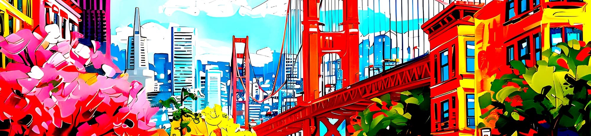

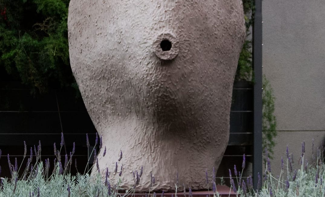
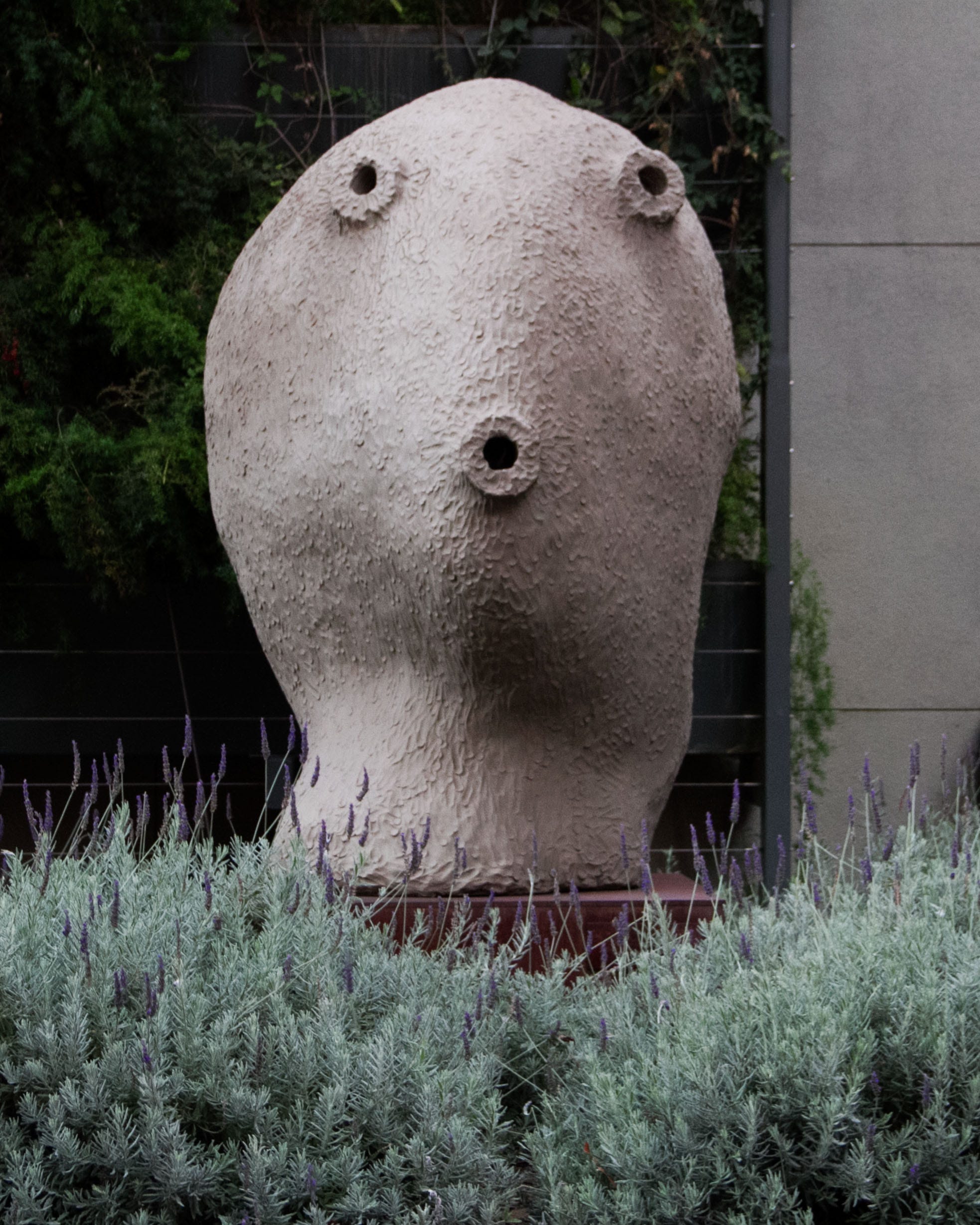
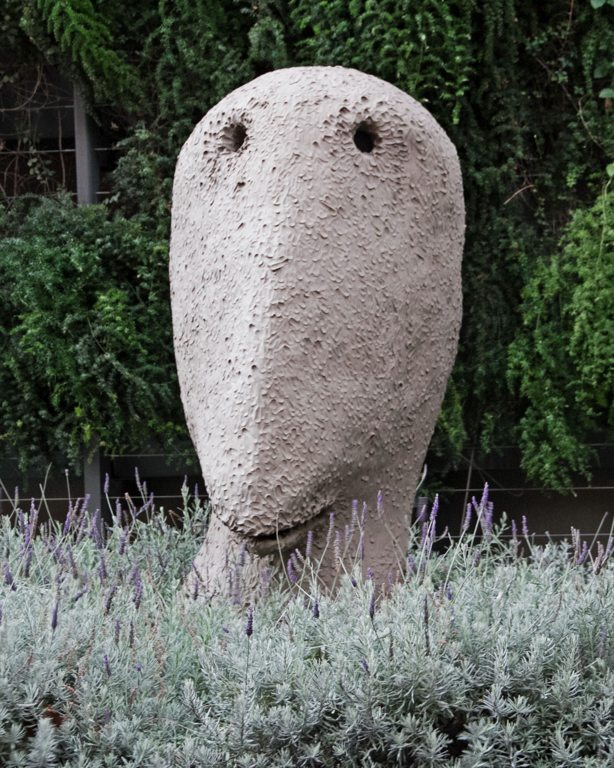
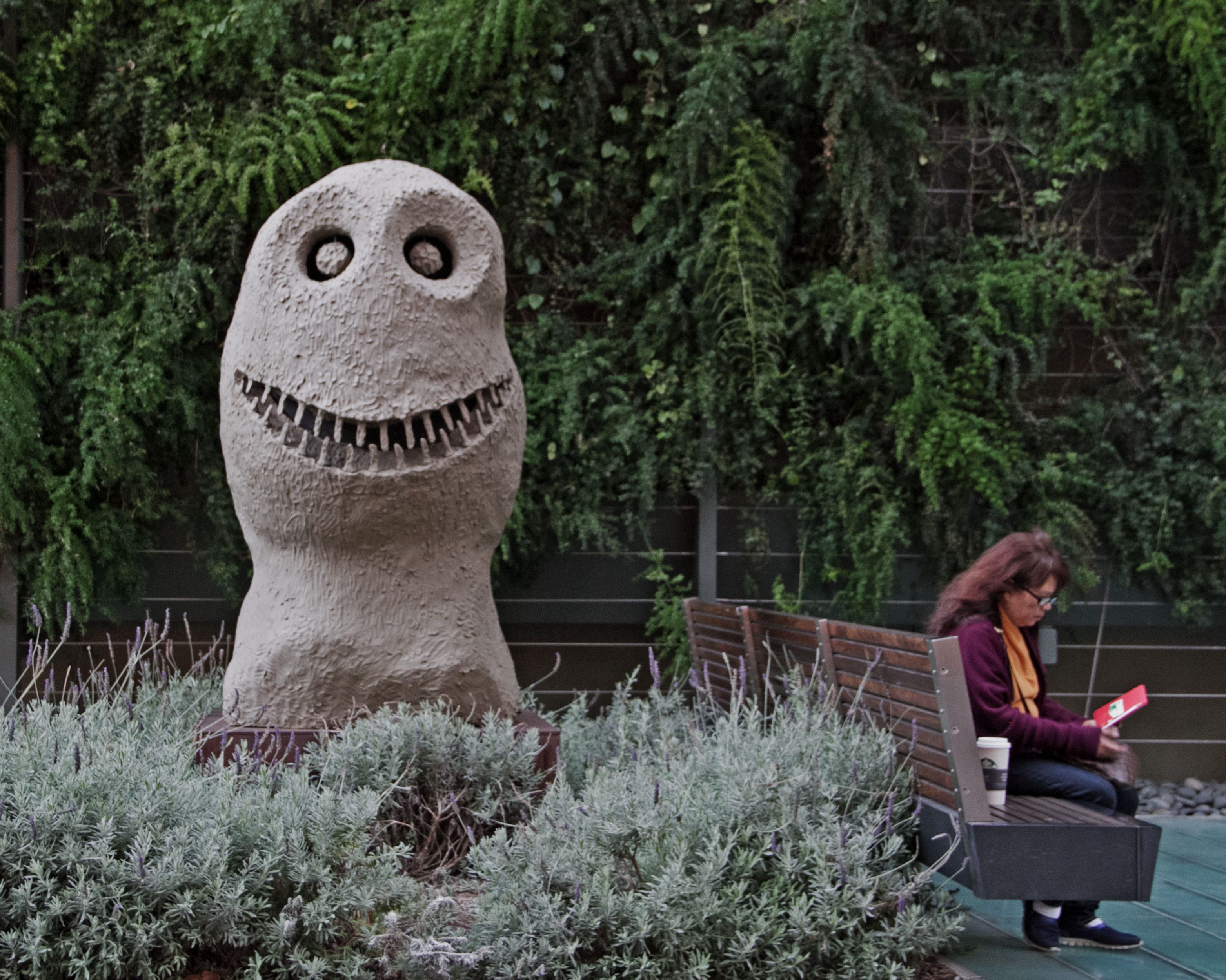
Three figures rise from the concrete at 555 Mission Street in San Francisco. The first seems to be some kind of awestruck root vegetable; the second, a remorseful duck; the third, a toothed and wicked thumb.
The three members of the trio — titled Moonrise by Ugo Rondinone, a Swiss artist who specializes in creating forms resembling unhappy potatoes — punctuate the spaces between benches in the plaza outside the Deloitte building. It’s a popular place for office workers to take lunch breaks al fresco. Though looking at this taupe and turd-like collection, it’s hard to imagine anyone keeping up their appetite.
San Francisco’s public art runs the spectrum from the spectacular to the spectacularly wretched. The reason for Moonrise and similar installations is a well-intentioned though ill-administered policy that mandates that all downtown development allocate at least two percent of estimated building costs to art enrichment. Not to belittle the capability of well-monied financiers to make public art possible, but some pieces make it seem as if the company president had an out-of-work nephew with an art degree and access to a scrapyard.
At other times, the work seems to have been chosen on the basis of the international prestige of the creator and the expense of the materials, rather than any sort of artistic merit or the ability of the work to actually say something.
And then there is the third category of wretched art, whereby, seemingly overwhelmed and in a panic, the developer filled any available space with visual clutter—like a first-year student in a freshman dorm coating the walls with movie posters and beer adverts.
Of course, the question of what makes art good or bad is tremendously subjective. Tolstoy said that the purpose of art is to describe visually what might be impossible in argument. The point is to inspire in the viewer the same feelings the artist experienced during the making of the art. Or at least the point of art is to inspire some feelings — any feelings — even if they aren’t identical to those of the maker.
Art can be judged “bad” not when it’s poorly made or when it’s ugly or offensive, but when it’s so uninspiring that it becomes invisible.
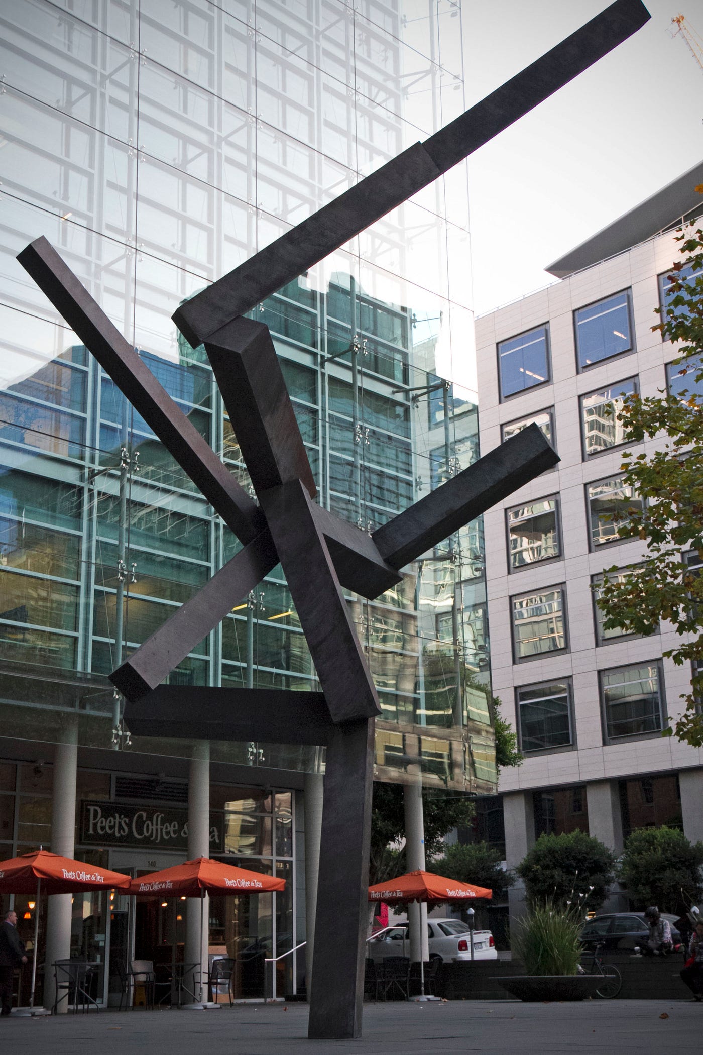
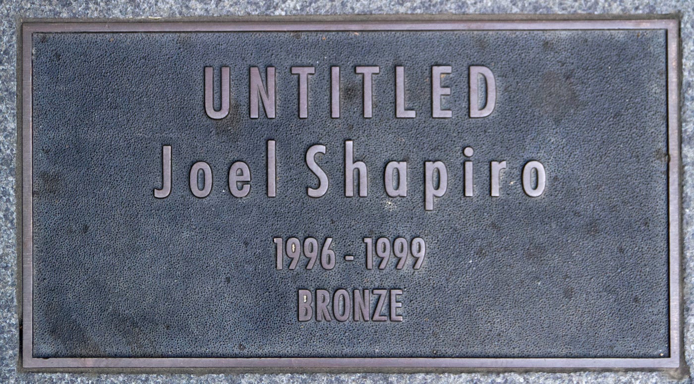
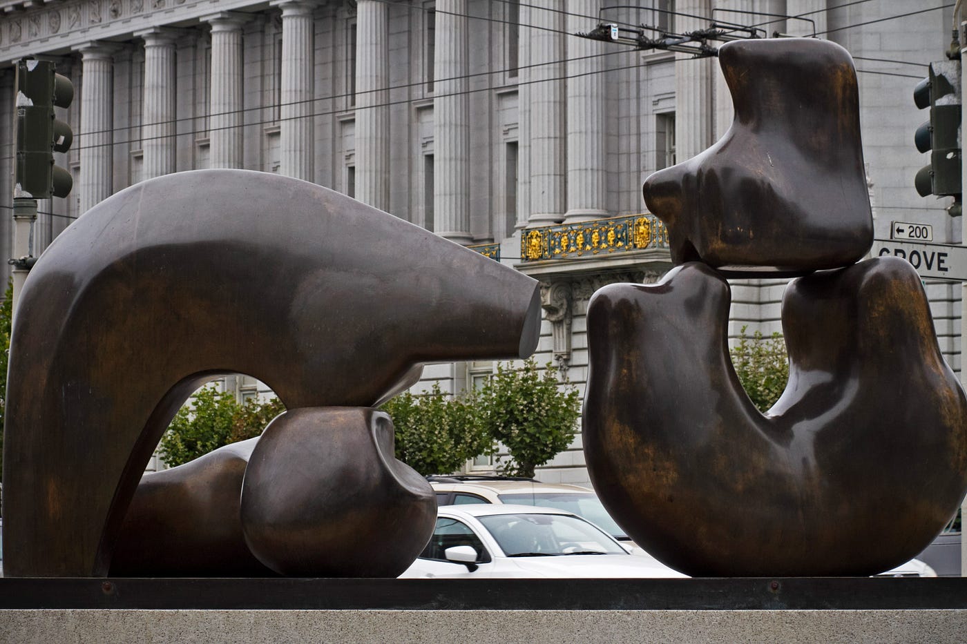
One of the defining qualities of bad art is that it simply isn’t good art. I had been going past a sculpture at the corner of Grove and Van Ness for years — “Four Figures in Repose” — before I actually noticed it, and then only when someone pointed it out to me. “A new piece,” I thought. But when I read the plaque, I learned that it had been donated to the city in 1980.
There’s a great deal of art that not only doesn’t say anything important but also doesn’t even say anything interesting. When a piece is so devoid of expression, the only question it inspires is, “You mean someone actually paid for this?”
My own experiences with Moonrise and Four Figures in Repose made me wonder about other pieces out there.
I asked friends, coworkers, baristas, booksellers, people waiting at the bus stop—anyone—for their own bad-art recommendations. The most consistent nomination was the bow and arrow along the Embarcadero. Or as it was more often referred to, “that fucking bow and arrow on the Embarcadero!”
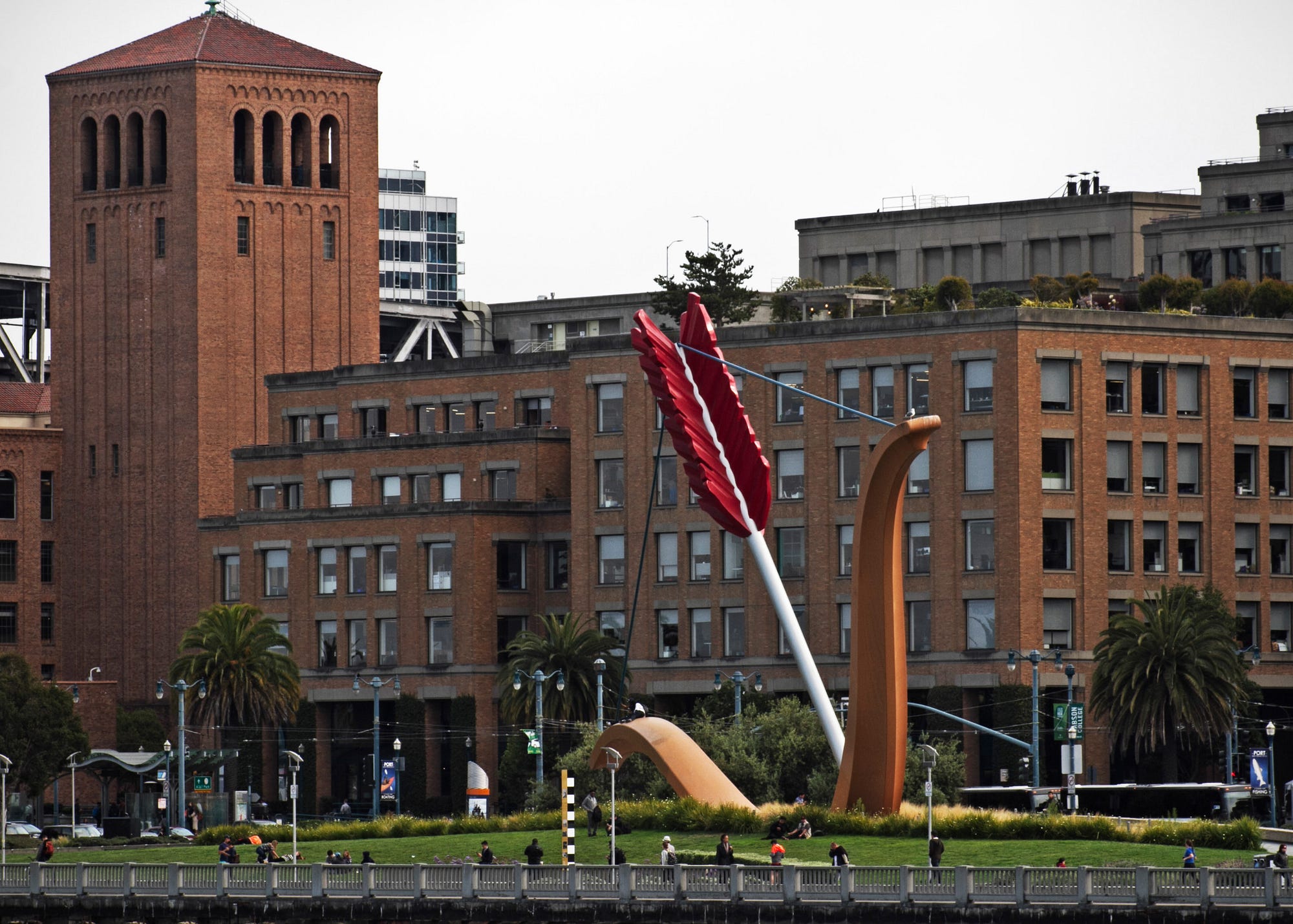
Officially titled Cupid’s Span, the sculpture was the brainchild of Coosje van Bruggen and Claes Oldenburg, and was commissioned in 1999 by Gap founders Donald and Doris Fisher. (Gap headquarters is across the street.)
Unveiled in 2002, the park around the sculpture’s base is an appealing alternative to Interstate 380, which used to run along the Embarcadero before the Loma Prieta earthquake leveled it. The grassy patch has lovely views of the bay, the Bay Bridge, the Ferry Building and the old Hills Brothers coffee building—views that, depending on your position, mercifully exclude this insipid arrangement. But appreciating this tidy bit of green is like admiring a painting for the pretty frame. Anywhere else along the Embarcadero, from the firehouse to the Ferry Building, Cupid’s Span presses to the fore like a precocious child who can’t help getting in front of the camera lens, even if he is blocking your engagement photo.
“There’s a certain skill you need to make art on this scale,” Oldenburg said in a 2002 interview with SFGate, which is about the only statement by either artist that everyone can agree on. Oldenburg’s defense of Cupid’s Span as being inspired by “San Francisco’s reputation as the home port of Eros” just feels made up. Emotion can’t be given the geographic specificity of a cheesesteak. People fall in love all over the place. If they can do it in Fresno, they can do it anywhere.
It’s not hard to imagine Oldenburg pairing declarative sculptures with similarly false expositions for other cities around the globe:
“It is well known that comedy began in Lima …”
“Without a doubt, fire was invented in Delhi …”
“As we all know, Saint Louis is the birthplace of oatmeal …”
There is the popular claim that Cupid’s Span is a reference to “I Left My Heart in San Francisco,” but Oldenburg makes no mention of this on his own website, insisting instead that the piece evokes “the mythological account of Eros shooting his arrow into the earth to make it fertile.”
Is that really part of the Cupid myth?
Sure. Why not. The Greeks had a lot of myths.
The remainder of his explanation is a collection of self-aggrandizing bullshit (for the artist) and non-specific praise (for San Francisco) that makes the reader wonder if Oldenburg has ever even visited the city.
“You find the same diversity and range of taste — and bad taste — in an outdoor environment as anywhere else,” van Bruggen said in the same SFGate interview. “Probably you have more in a city because you have a lot more watering down,” she continued. And then, as though excusing what she had wrought upon our city, she said, “Art is something that cannot be confirmed by everybody.”
In reading that, I can’t help but feel that the two artists deliberately sought to make something both tacky and overreaching, then cooked up some adequate reasons — mythology! whimsy! love! — why we should never look too closely at the gifted horse’s ass.
Flattery is designed to make those who disagree look disagreeable. Oldenburg positions the artist as an unassailable philanthropist genius who leaves the viewer to the role of indefensible philistine. We should be grateful to be in the presence of his brilliance.
“There’s the man-in-the-street opinion, but then there’s the more nuanced response,” Oldenburg said. Those who don’t like it simply don’t get it. Not everyone can see the emperor’s shiny new clothes.
“Ugliness is in a way superior to beauty because it lasts,” said famous French polymath and gargoyle Serge Gainsbourg. So perhaps it’s our standards that are wrong headed rather than the works themselves.
Most of the bad art out there falls into one of two categories. Either “You know, this could have been done better” or “I’m not sure how this could have been any worse.” Members of the second class are far rarer than members of the first, though transcendent where they exist.
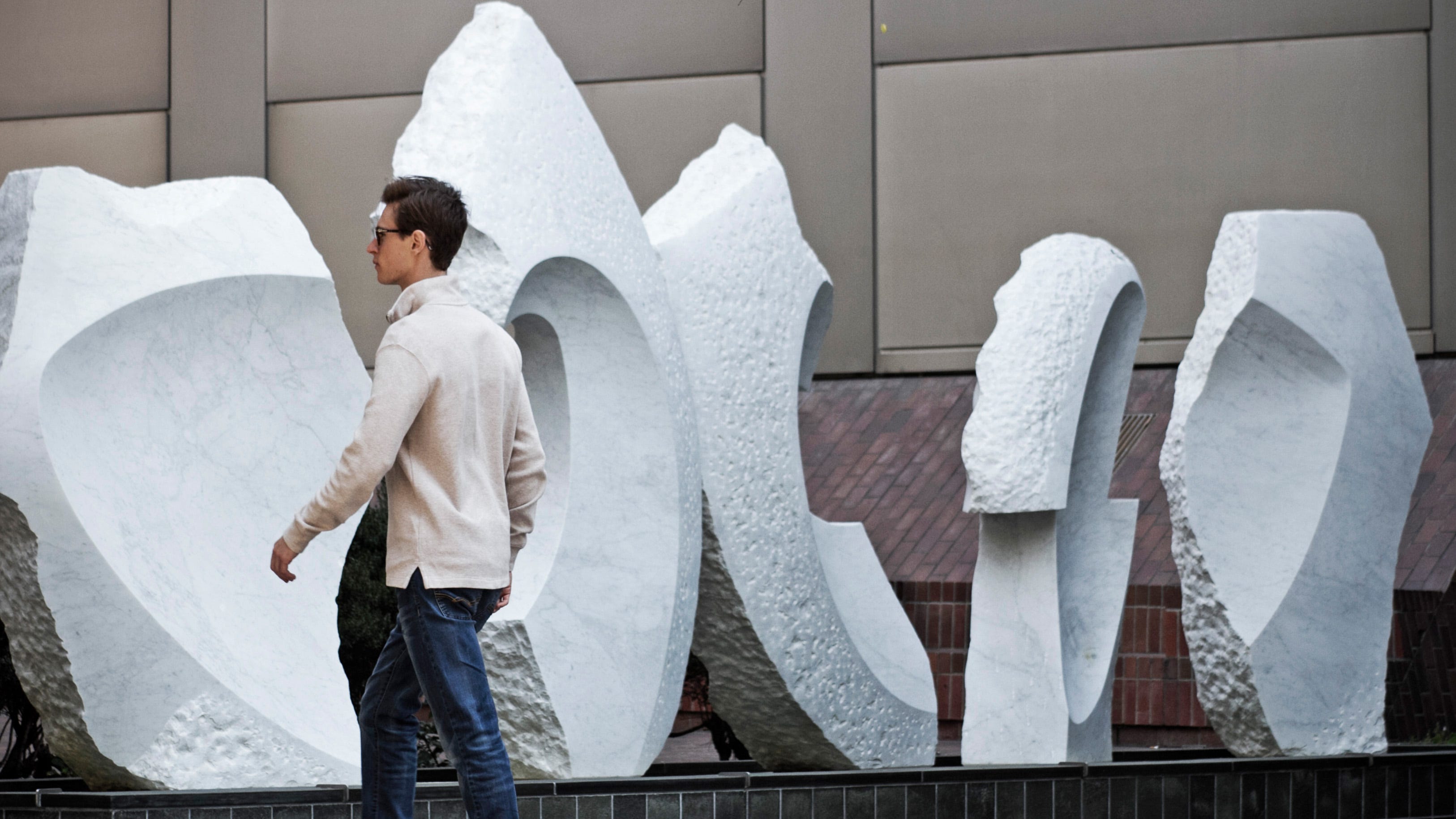
It’s fitting, then, that for me, the piece that performed the deft 180 from wretched to admirable is “Transcendence” by Masayuki Nagare. A wedge of black granite swells upward from the plaza at 555 California Street, looking like nothing so much as a beached whale that’s slowly deflating and liquifying back into muck. I detested “Transcendence” as another misguided interpretation of city law until I learned its informal name of “The Banker’s Heart,” and suddenly it became brilliant.
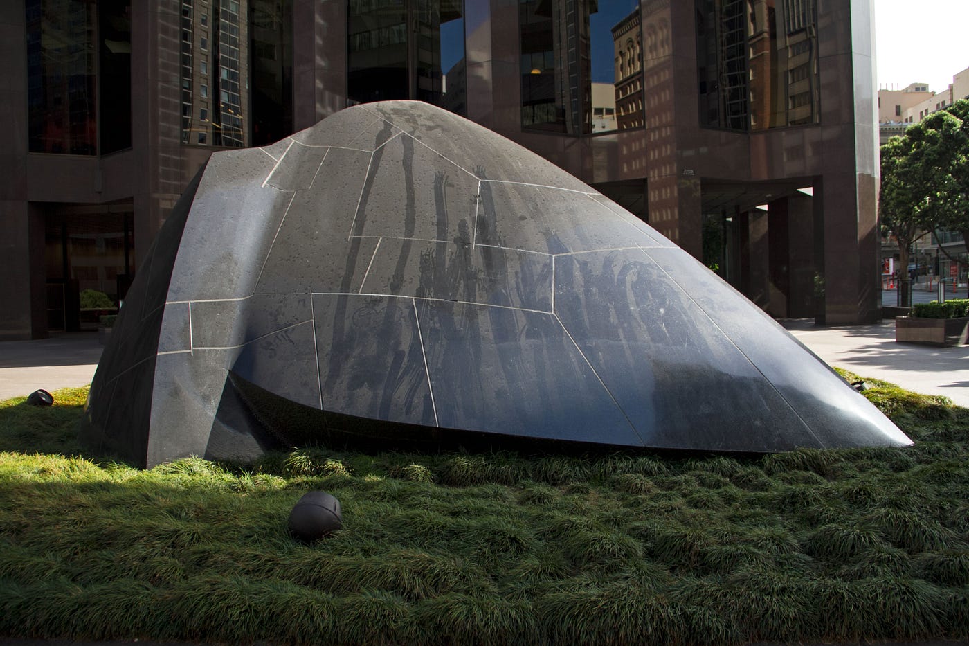
In a city where everyone likes to coo about “leaving their heart,” the piece is unintentionally genius. There is just no way it could ever be confused with the cutesy-poo fiberglass hearts strewn about San Francisco, which coddle and infantilize viewers with their saccharine and tourist-friendly inoffensiveness. “The Banker’s Heart” is a testament to callous and determined progress, a granite U-boat plowing a resolute wake through a sea of turf, pressing ever onward, indifferent to any notions of fairness or taste.
In many ways, the laws mandating public art parallel the 19th century push for public parks. Frederick Law Olmsted, the father of American landscape architecture, best summed up the benefits of public space in his description of Central Park:
“It is one of the great purposes of the Park to supply to the hundreds of thousands of tired workers, who have no opportunity to spend their summers in the country, a specimen of God’s handiwork that shall be to them, inexpensively, what a month or two in the White Mountains or the Adirondacks is, at great cost, to those in easier circumstances.”
In the same vein, these installations of public art are meant to be enjoyable to all, even and especially by those least able to pay, while charging installation and upkeep to those who can most afford to give. And that’s an idea worth backing, however poorly executed.
Public art is still art, and keeping it public is a good idea. But might I suggest that instead of scouring the Baltic for the finest idiocy money can buy, perhaps developers can take that mandated two percent and fund a few of the savvy artists of Clarion Alley or the rising stars of SFAI ?
Sure, there’s a chance the kids might come up with something cumbersome, embarrassing and downright ugly, but it would be the kind of ugly that fills you with civic pride. The kind that could happen only here. I, for one, feel confident that those artists could do a better job. They certainly couldn’t do any worse.
The SF Art Scene
The Bold Italic is a not-for-profit media organization, and we publish first-person perspectives about San Francisco and the Bay Area. We operate under a fiscal sponsorship of a 501(c)(3).
You can become a paid subscriber. Or donate. Or learn more about us.