

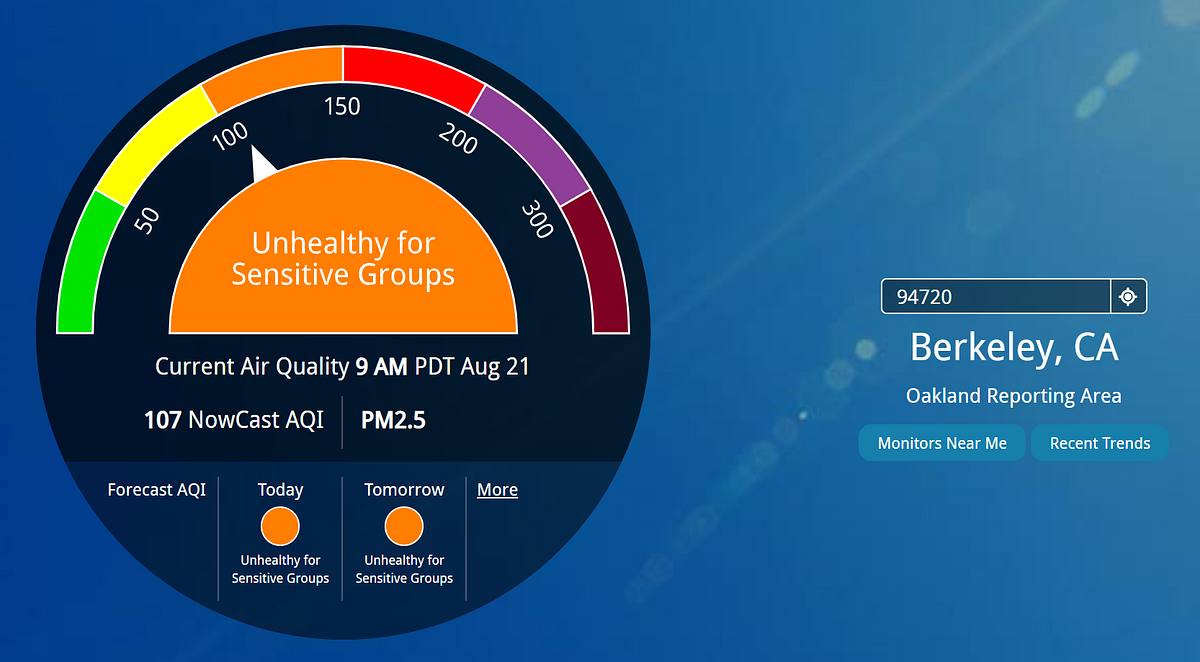

You may have noticed PurpleAir and AirNow.gov giving different Air Quality Index (AQI) values for your zip code. For example, on August 21st, when I checked these sites, the AQI given on AirNow.gov for the 94720 zip code of Berkeley was 107. By contrast, PurpleAir gave values that are in the 130s to 150s.
With the help of Brett Singer, an air quality scientist at Lawrence Berkeley Labs, Arian Dybwad, CEO of Purple Air, and various folks at the EPA, I was able to mostly piece together what’s going on.
First, let’s discuss correction factors. Empirical studies have found that PurpleAir monitors tend to yield larger AQI values than EPA monitors like those used by AirNow (see end of this article for more on why) when measuring wood smoke. To correct for this, PurpleAir provides several correction factors you can use to get a better estimate.
Sign up for The Bold Italic newsletter to get the best of the Bay Area in your inbox every week.
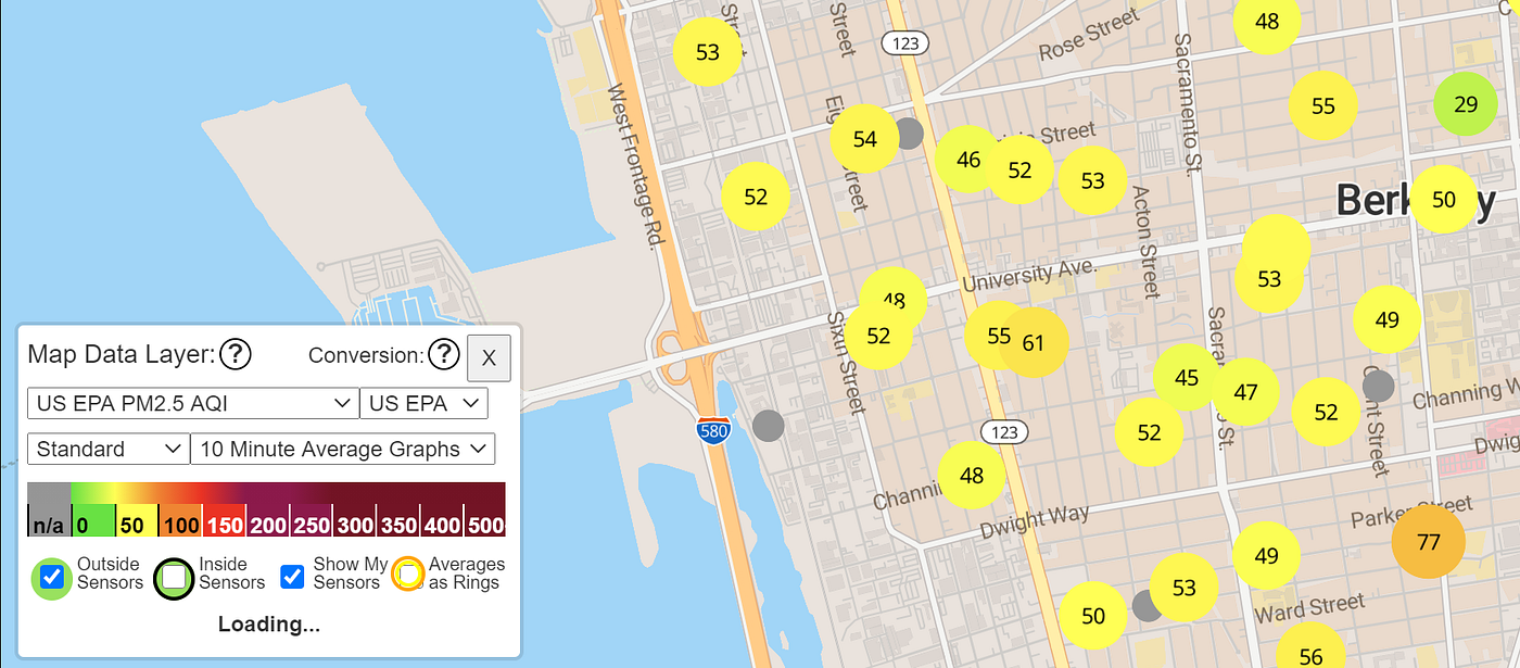
We recommend using the EPA correction factor (available as of 10/3/2020). To do so, click the word “None” and change it to “US EPA”. When you do this, you’ll see numbers that should be more directly comparable to AirNow. Without using a conversion factor, you are comparing apples to oranges. Please note that these factors are specifically useful as a correction factor for areas where PM 2.5 particles are dominated by wood smoke. You should not use them in other circumstances. For more information on PurpleAir sensors and wood smoke events, see this paper from the EPA.
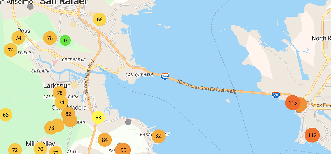
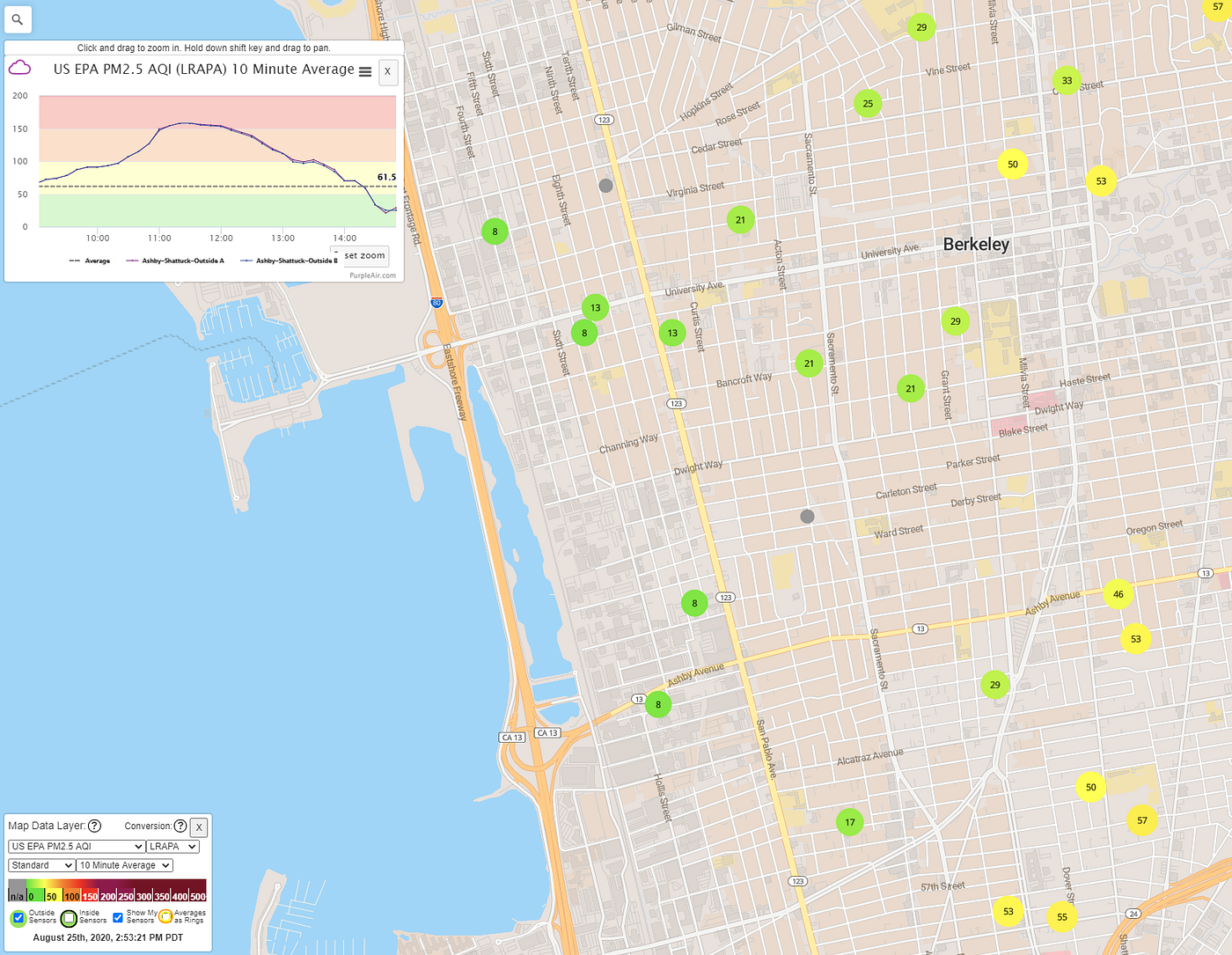
For example, the image below shows PurpleAir with LRAPA enabled.
Note that an earlier version of this article you’re reading suggested using LRAPA. This was before the US EPA was available.
Understanding how AirNow reporting areas work
By applying a correct factor, we have greater confidence that the Purple Air numbers are on the same scale as AirNow. However, you should also be aware that the AirNow front page number is somewhat delayed and may also not represent your immediate geographic area.
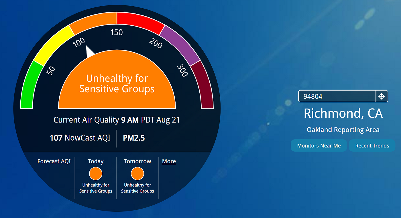
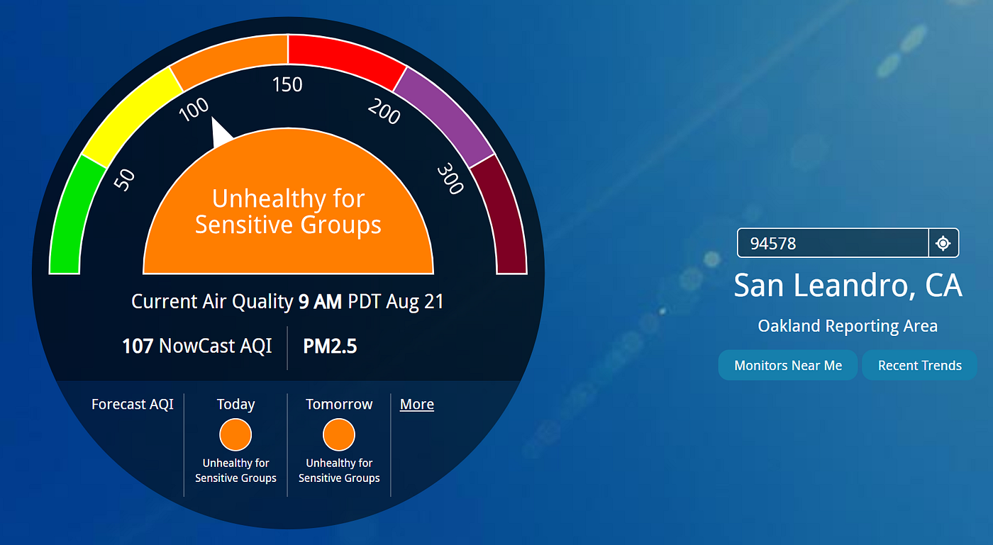
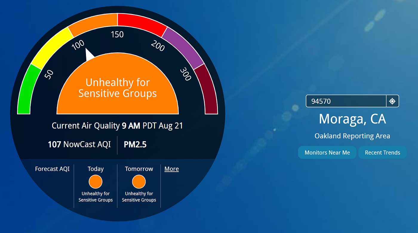
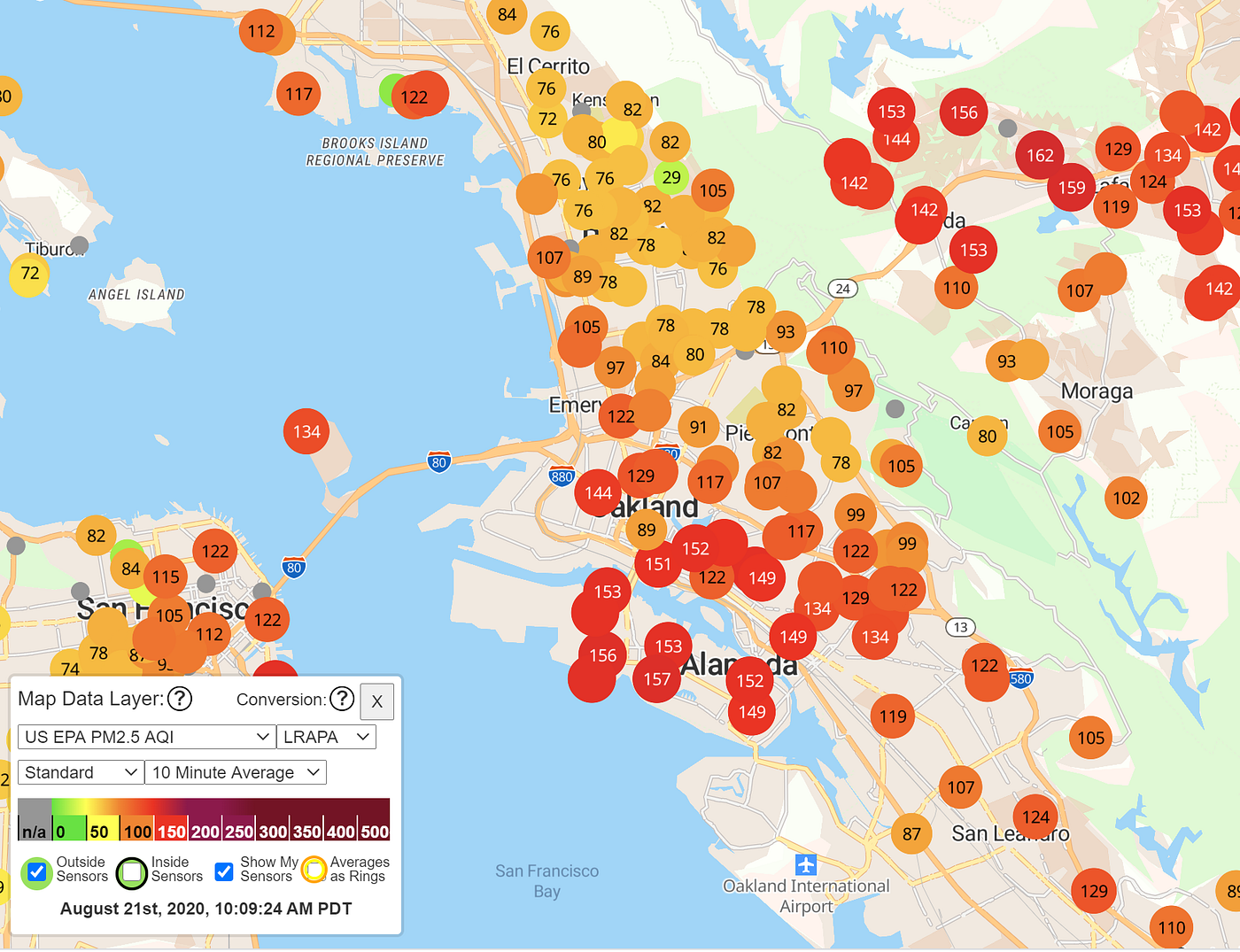
For example, if we try zip codes as far flung as 94804 (Richmond), 94720 (Berkeley), 94578 (San Leandro), or 94570 (Moraga), you’ll see that you get the exact same AQI. For example, on August 21st, the AQI for these zip codes was 107 for all of these locations:
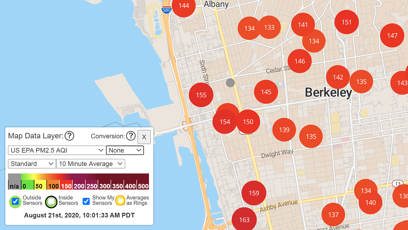
But looking at the PurpleAir, we see that the AQI across this huge ~100 square mile region is highly variable, with values of 150+ in Orinda, but only 80 or so in Berkeley: (Note the image below uses the out of date LRAPA conversion factor, you should use US EPA instead).

It turns out there are four sensors in the “Oakland Reporting Area” that we can see on a map by clicking “Monitors Near Me” on AirNow.gov:
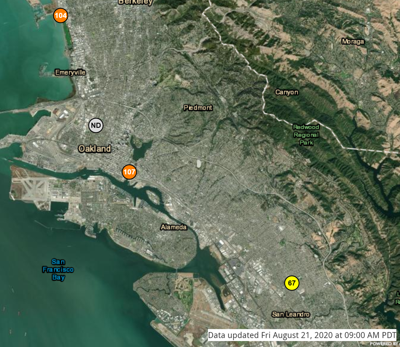
These sensors are at Berkeley Aquatic Park (AQI: 104), West Oakland (AQI: No Data Available), Laney College (AQI: 107), and East Oakland (AQI: 67).
Note that the Laney College AQI is exactly the same as we got for all zip codes in the reporting area. This is no accident. The front page of AirNow simply returns the max of the sensors in the reporting area corresponding to your zip code.
In some cases, this can lead to pretty inaccurate results if you just use the front page numbers without looking at the map. For example, if you enter the Point Richmond zip code (94801), this is in the San Rafael reporting area.
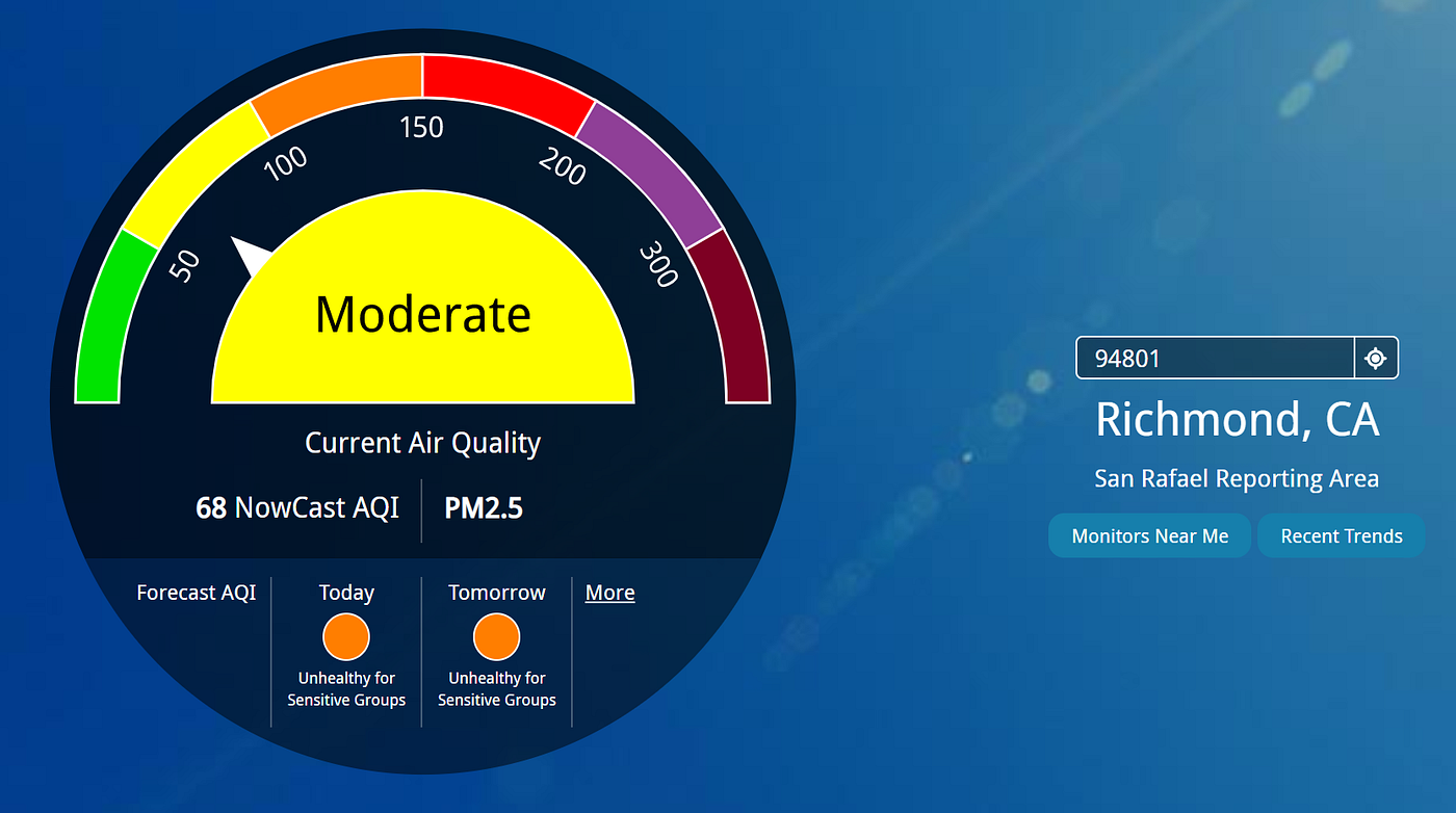
This area consists of a single sensor in San Rafael, so even though Point Richmond has an AQI of around 110 on Purple Air, AirNow.gov provides you with the AQI for the San Rafael sensor (in the mid 60s).
In short: Because of location issues, I wouldn’t use the AirNow front page number. Instead, either use the AirNow map and find the sensor closest to you, or use PurpleAir with the LRAPA conversion factor enabled. However, there’s another reason to be careful with using AirNow: Time delay.
Understanding time lag and time averaging
There’s one last important phenomenon that is worth mentioning during a smoke event like the current moment where AQI varies dramatically from hour to hour.
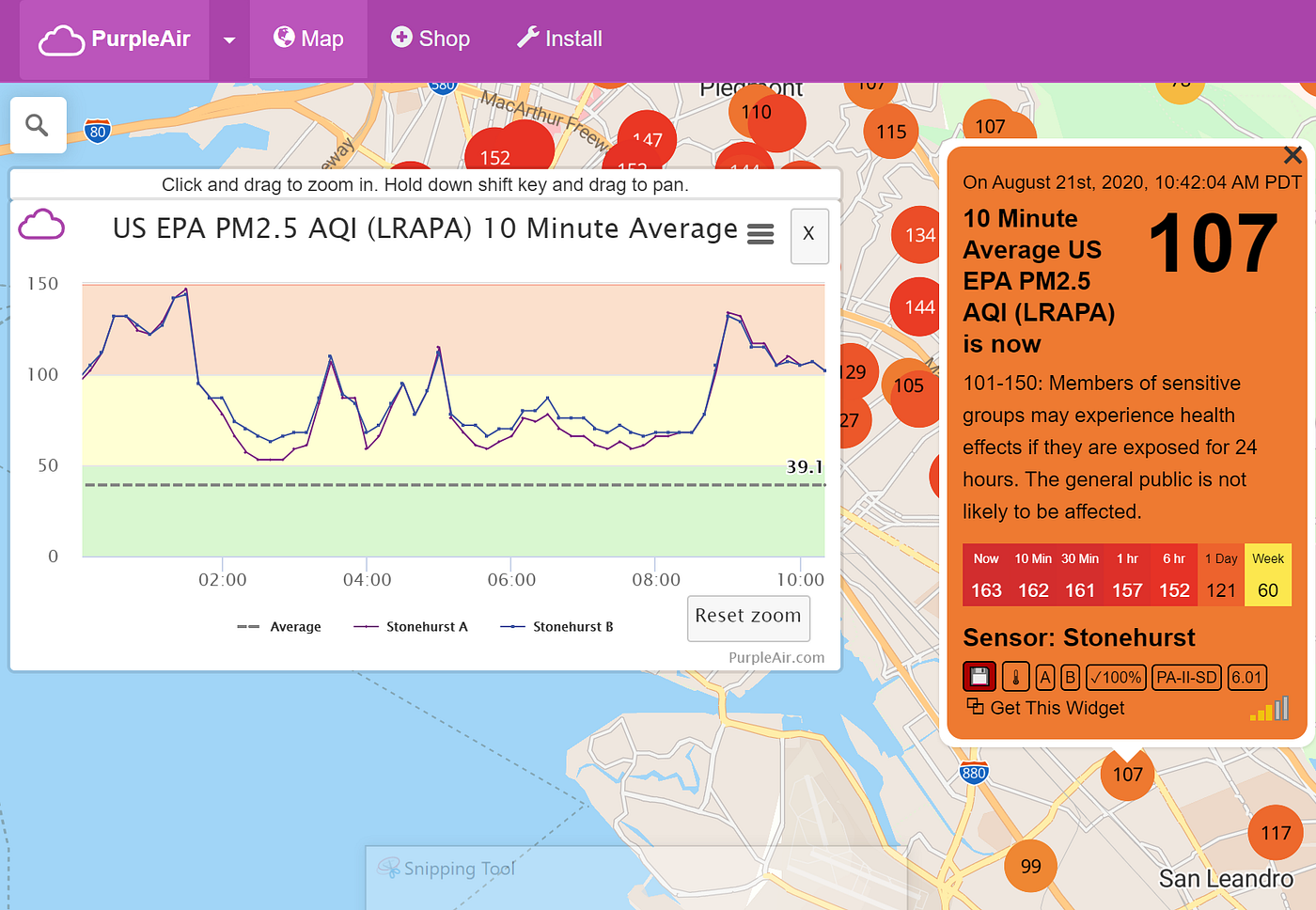
Earlier, we saw that the AirNow East Oakland sensor had a strangely low AQI of 67:

This is compared to Purple Air, which would suggest an AQI of more like 110:
This is because the PurpleAir numbers are averaged over the last 10 minutes, whereas the given AirNow numbers are the average over a longer period of time. Thus if conditions are rapidly changing, the AirNow numbers maybe delayed. See Note #4 at the end of this article for the full details.
If we click on the sensor that looks closest to AirNow’s East Oakland sensor, we see that right before 9 AM, there was a spike in AQI, and before this spike, AQI was in the 60s, as reported by AirNow.gov’s map. The AirNow map has simply not had a chance to react to the sudden change in conditions.
Note: You can also change PurpleAir to give “One Hour Average” instead of “10 Minute Average” to behave a little bit more like AirNow, but in my opinion this defeats one of the advantages of PurpleAir, namely that it lets you see real time data.
fire.airnow.gov
(Added 8/25/2020): Recently, the folks at AirNow.gov created a map specifically useful for wildfire smoke at https://fire.airnow.gov. This page is great because it includes both lower cost (e.g. PurpleAir) sensors and the official permanent sensors, and also applies correction factors automatically to keep them all on the EPA approved scale. Permanent sensors are the large circles, and the lower cost sensors are the smaller squares.
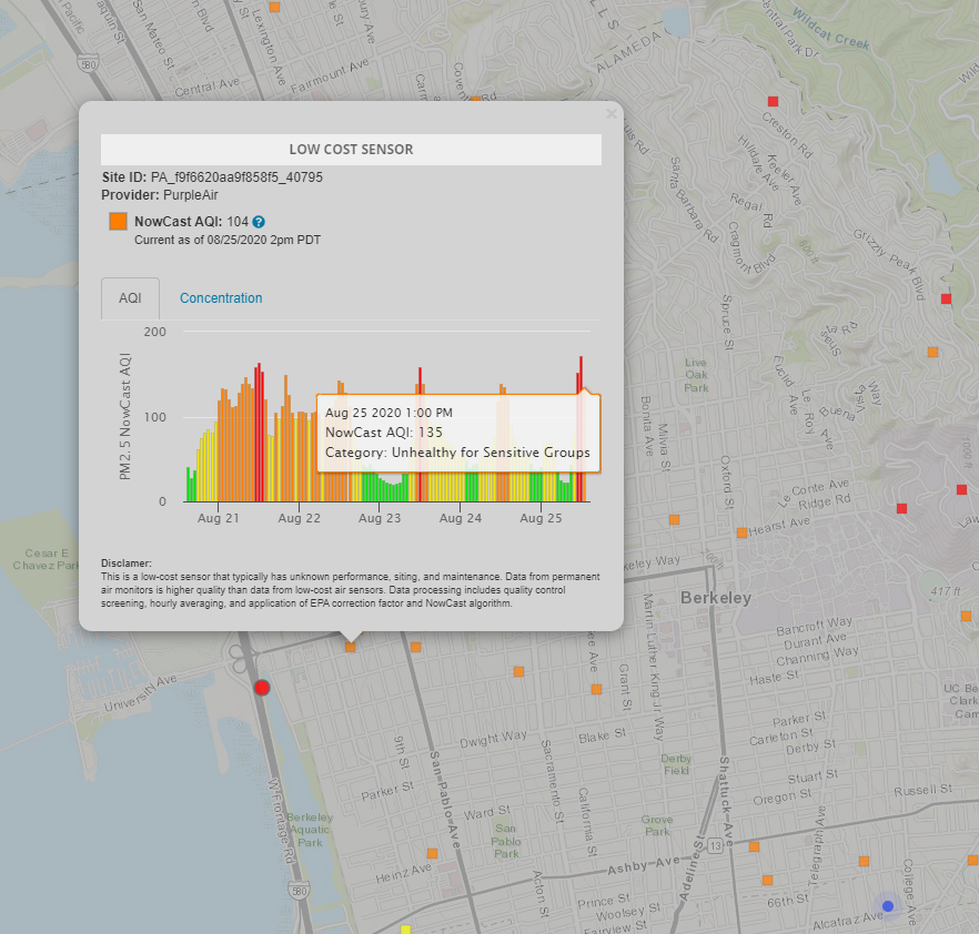
The downside of fire.airnow.gov is that you still have a time lag when conditions change rapidly. The screenshot above was taken at 2:52 PM, while PurpleAir was already reflecting rapidly improving conditions:
AQI vs. Concentration and the Toxicity of Wood Smoke
The values we’ve discussed earlier in this article are all AQI. However, all air sensors actually measure particles in units of micrograms / cubic meter. You can use the AirNow calculator to convert between these two different units. For example, if there are 35.4 micrograms per cubic meter of PM 2.5 particles, this would correspond to an AQI of 100.
This conversion is done irrespective of the actual composition of the PM 2.5 particles in your area. To make a somewhat silly and extreme example, if your PM 2.5 were entirely composed of highly radioactive plutonium chunks, you’d get the same AQI number as if the PM 2.5 were composed of innocuous silicon.
I asked the EPA whether or not an AQI of 100 during a wood smoke event might be worse than an AQI during a typical day dominated by the usual pollutants. Their response was: “There is some limited evidence that wildfire smoke may be more toxic than urban PM that can be dominated by diesel exhaust and industrial emissions. Wildfire smoke includes many other compounds that are emitted in lesser amounts compared to PM but still at considerable concentrations like benzene, formaldehyde, and polycyclic aromatic hydrocarbons. Additionally, if a wildfire burns homes or vehicles, these toxic compounds may be emitted in greater amounts along with hazardous levels of metals and acid gases that are not usually found in wildfire smoke. Jaffe et al. 2020 (DOI:10.1080/10962247.2020.1749731) has a nice overview of the current state of knowledge of what is emitted from fires and the health effects of wildfire smoke.
However, there is still not enough research to support the use of a different AQI metric or provide differing public health guidance for wildfire smoke in comparison to typical ambient PM.
More discussion is available in the Integrated Science Assessment for Particulate Matter (https://cfpub.epa.gov/ncea/isa/recordisplay.cfm?deid=347534)”
Recommendations
If you want the most up-to-date AQI measurements, I’d recommend using Purple Air with AQandU enabled. Once the EPA conversion factor is available on PurpleAir I’d use that instead.
Given the potentially greater danger of wood smoke particles, it’s probably worth treating the AQI numbers with somewhat greater caution than on days that don’t involve wood smoke.
If you decide to use the front page AirNow.gov, be aware that the delay may be delayed and not specific to your current location. fire.airnow.gov gives you a nice map, but will also be delayed if conditions are changing rapidly.
Further reading and notes:
- If you don’t like using AirNow.gov’s map but still want the data from their higher quality sensors (for example, because you are required to use official government data as the administrator of a facility), you can also see the current data in tabular form here.
- “Low-Cost Home Air Quality Monitors Prove Useful for Wildfire Smoke” by Woody Delp and Brett Singer at LBL. Thanks again to Brett Singer for info on LRAPA.
- The laser sensors used by Purple Air rely on a hard-coded constant that represents the average density of the particles it is detecting. Because wood smoke particles are less dense (1.5 g/cm³) than typical PM 2.5 particles, the resulting AQI values are too high. This is the reason that LRAPA conversion is necessary. Thanks to Adrian Dybwad.
- AirNow actually does something more complicated than a 1 hour average that is delayed by up to 3 hours, but the basic idea holds: AirNow data is averaged over a longer time period and will be delayed compared to PurpleNow. See this link for more.
- The EPA has its own correction factor that iwll be more accurate than LRAPA or AQandU across a wider variety of smoke concentrations. From the EPA:“EPA’s Office of Research and Development researchers found that PurpleAir overestimate PM2.5 concentration most of the time during typical U.S. conditions (e.g. 0–50 ug/m3 typical ambient aerosol), not just during smoke impacts. The work of EPA researchers has looked at data from PurpleAir sensors operating alongside permanent monitors at 39 sites across the U.S. to develop a correction equation that reduces the high bias of the PurpleAir sensors so that they are more comparable with permanent AirNow monitors. The correction equation was also tested for performance during smoke impacted periods where concentrations are higher (tested through 250 ug/m3).” You can read about the development of this correct factor at PurpleAir PM2.5 U.S. Correction and Performance During Smoke Events 4/2020. This new formula was developed for PurpleAir concentration measurements between 0–250 ug/m3 range (>250 PurpleAir may underestimate true PM2.5), which corresponds to an AQI of 300 or less. The formula is “PM2.5 (µg/m³) = 0.524*PA(cf_1) — 0.0852*RH + 5.71”. To be honest, I’m not sure what this means, but if you’ve looked at the PurpleAir data closely, you might know whatRH and PA(cf_1) mean.
- Edit 10/3/2020: My original recommendation to use LRAPA was from Brett Singer, who specifically studies air quality. Now that the US EPA factor is available, you should use that instead.
The Bold Italic is a not-for-profit media organization, and we publish first-person perspectives about San Francisco and the Bay Area. We operate under a fiscal sponsorship of a 501(c)(3).
You can become a paid subscriber. Or donate. Or learn more about us.