

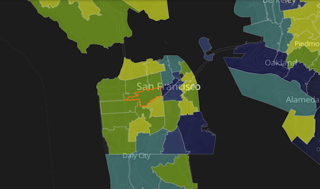
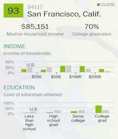
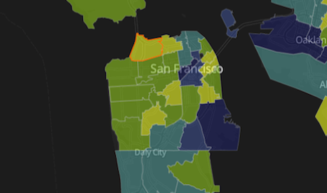
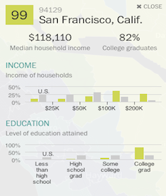
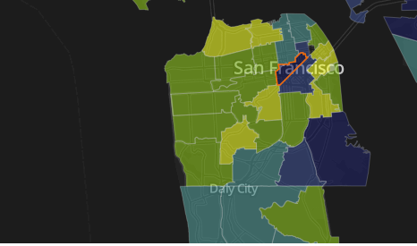
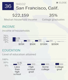
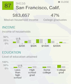
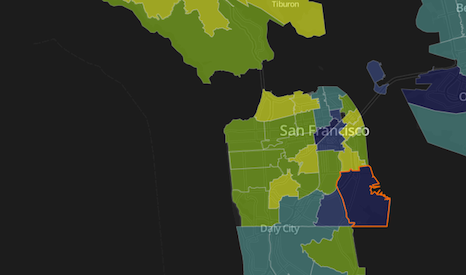
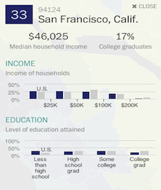
A new interactive map published by The Washington Post shows the average education and income of different zip codes. Every zip code is graded on a scale from zero to 99 that reflects the average percentile ranking for higher education and income levels. The graphics by Wilson Andrews and Emily Chow were intended to highlight yellow “Super Zips,” or zip codes with a ranking of 95 or higher, but it is interesting to poke around and search beyond the Super Zips. Below are just a few examples of some SF zip codes, but I encourage you to check out the rest of the map here.


The Bold Italic is a not-for-profit media organization, and we publish first-person perspectives about San Francisco and the Bay Area. We operate under a fiscal sponsorship of a 501(c)(3).
You can become a paid subscriber. Or donate. Or learn more about us.