


Seeing Papyrus get dragged on SNL inspired me to write this friendly guide detailing the only appropriate situations in which to use fonts that everyone hates.
But some complained that I’d skipped some of the most loathed fonts. And I didn’t actually include Papyrus, presuming that everyone knew already. Well, in case you missed the memo, here’s the only establishment that has the OK to use Papyrus on signage:
But you knew that, right? Anyway, here are the rest of the oft-disliked fonts and the only establishments and/or situations in which it’s OK to use them.
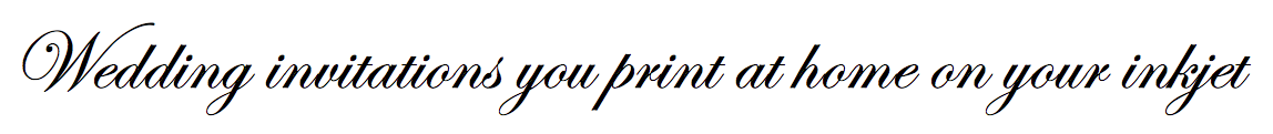
Edwardian Script ITC
Braggadocio
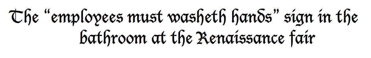
Cloister Black

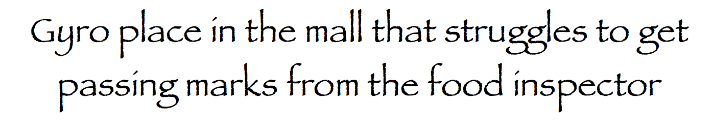
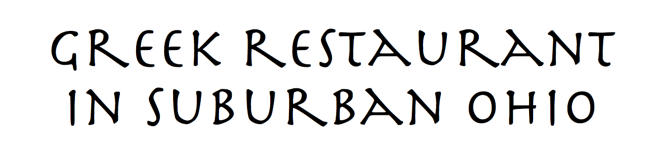
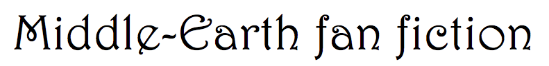
Herculanum
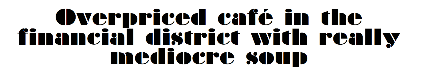
Bauhaus 93
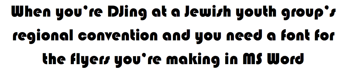
Lucida Blackletter
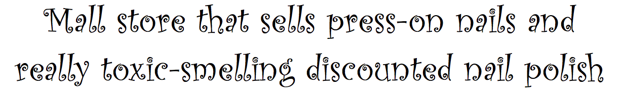
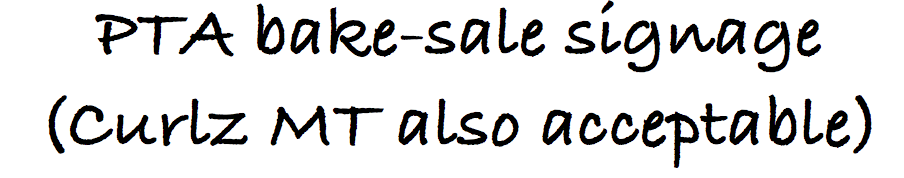
Curlz MT
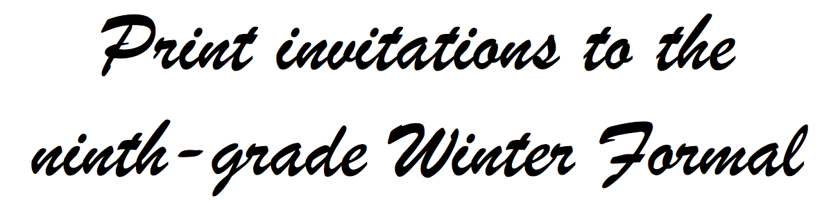
Brush Script MT
Harrington
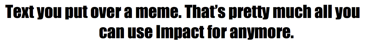
Impact
Bradley Hand
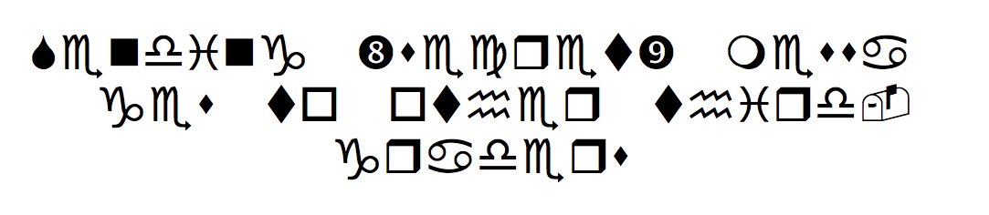
Wingdings
[No idea what’s going on? Go back and read part I here:]
The Bold Italic is a not-for-profit media organization, and we publish first-person perspectives about San Francisco and the Bay Area. We operate under a fiscal sponsorship of a 501(c)(3).
You can become a paid subscriber. Or donate. Or learn more about us.